
AXA Live
A corporate and editorial new generation intranet app
Why this project matters
In 2016, I designed the original AXA Live app at an agency. Ten years later, I completely rebuilt it as a self-initiated project.
More than a redesign, this was an experiment to test how far one designer can push an enterprise-scale app today using AI, rethinking complex flows while honoring constraints.
Product thinking
Product insight above all: People open an intranet with a task in mind. The reading follows.
The original product was AXA's internal newsfeed, built to broadcast. A few years after shipping, AXA itself named the tool's limits: top-down, passive, built to inform rather than involve. So I shifted the app from content people might read to tasks they’d like to know of. This also reflects the times: in 2016, large groups commissioned internal apps as brand showcases. Today, companies look for convenience.
Dual architecture
From passive magazine to daily employee tool: introducing dual-mode UX architecture
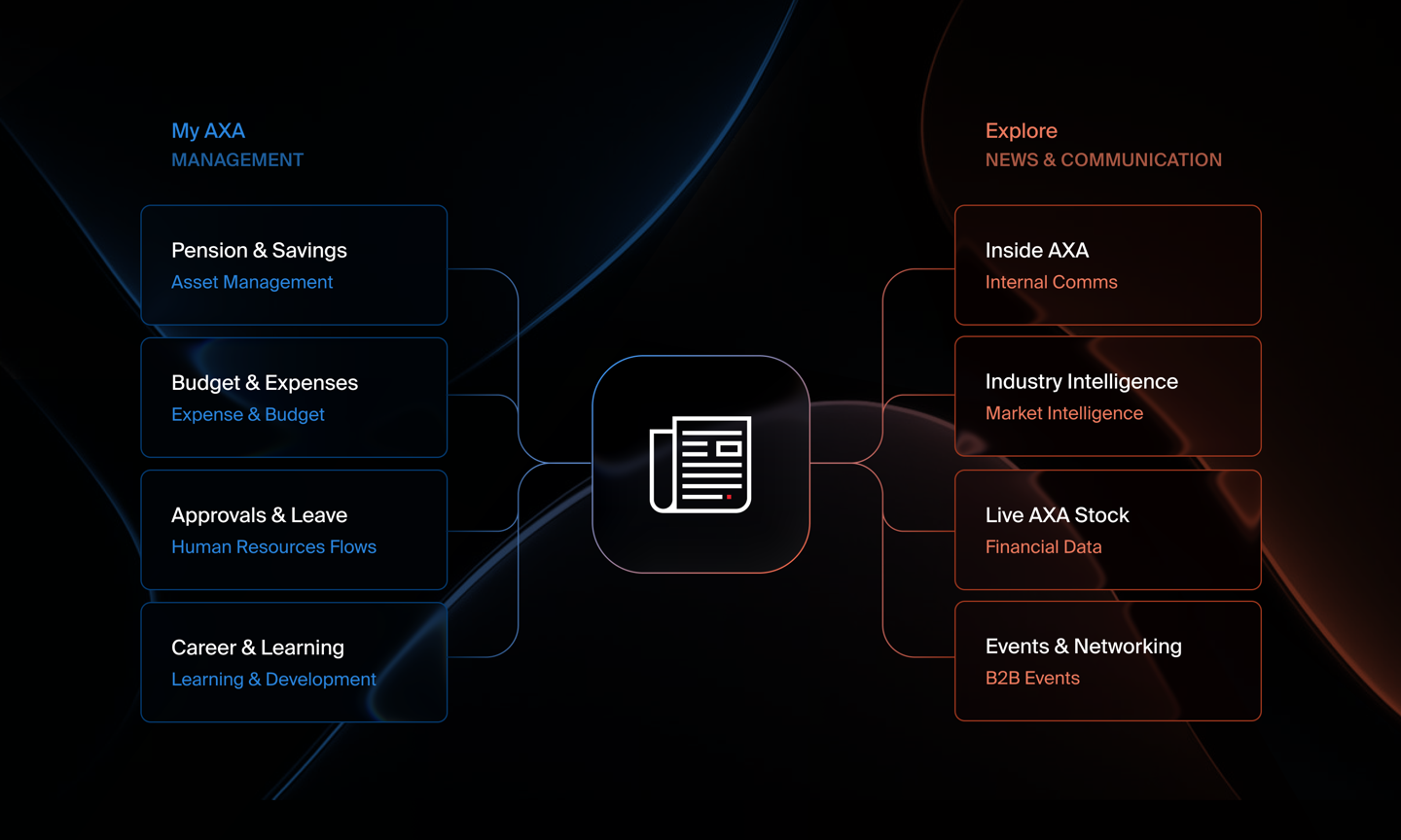
To make this vision work without cluttering the screen, I structured the interface into two distinct environments. The dynamic switch at the bottom gives employees immediate access to their personal workspace in “My AXA”, while keeping “Explore” dedicated to news. Each space uses its own visual tone, surface color, and density, ensuring users always know where they are.


Blending HR tools and news into a unified navigation
Adding HR management alongside company news risked overloading the interface. I split the experience into two clear workspaces using a dedicated mode switch and distinct brand colors: a dark blue theme for administrative tasks (“My AXA”) and a vibrant red for editorial content (“Explore”). This gives each tool a distinct focus while keeping the overall platform cohesive.
My AXA: management
Modernizing a corporate intranet to elevate the employee experience
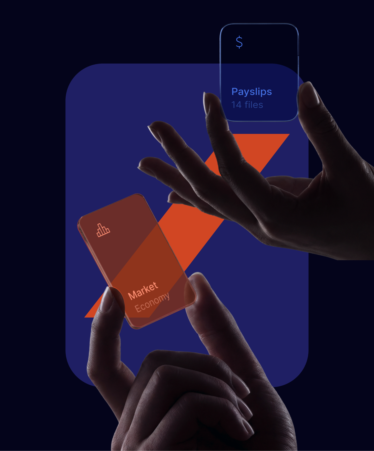
Internal tools deserve the same level of UX rigor as customer-facing applications. When redesigning AXA’s management platform, I set out to bridge the gap between heavy enterprise utility and modern digital standards. I implemented established fintech UI patterns, including real-time status indicators, inline table editing, and clear data visualization summaries, turning dense administrative workflows into an intuitive and efficient employee workspace.
Homepage
Structuring key HR data for instant answers
Essential info like salary, leave balance, and expenses was buried across multiple portals, driving up support tickets. I redesigned the homepage to highlight key financial updates at the top and pending requests right below. Employees can now get the answers they need in under three seconds without digging through complex menus.


Advance salary flow
Designing a frictionless, anxiety-free salary advance flow
Salary advance requests sit at the intersection of complex payroll rules, strict compliance, and high user anxiety. Employees accessing earned wages often face financial stress, making absolute transparency, zero hidden fees, and immediate feedback critical.
First wireframes with Claude Code
Static screens fail when financial calculations are involved. I used Claude Code to prototype the logic upfront instead of guessing UI states in Figma. Live coding allowed me to instantly test real-time math inputs like capped keypads, quick-add pills, and dynamic payslip deductions ($3,000 to $2,500) before locking the final design.


Salary advance: From code wireframe to high-fidelity UI with Figma
Prototyping in code established the core financial logic, but Figma is where I shaped the architecture. I used it to transition the flow from an isolated functional experiment into a cohesive system component, anchoring seamless entry points, spatial continuity, and high-craft visual polish directly into the main product.


On the right: Claude code - dynamic data & edge cases
Code vs Figma: Balancing visual fidelity and dynamic amounts
Figma and Claude Code do two different jobs. Figma is great for fine visual details and glass overlays, but salary advances are all about numbers. In Figma, you cannot easily show how taking 500 dollars today changes your end of month paycheck. Claude Code let me build a live calculator where users could type any amount, instantly see their new salary preview, and get blocked if they asked for more than their earned balance.
Request time off flow
Booking leave, team in mind
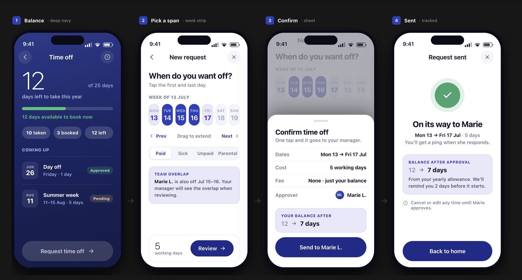
Time off affects the people around you. This flow surfaces context before you submit by showing if a teammate is already off on those exact dates. Instead of a full month grid, it uses a horizontal week strip so you can pick dates quickly, preview your new balance, and send the request in seconds.
First wireframes with Claude Code
I used Claude Code to quickly move from user intent to low fidelity screens. Prompting AI for dynamic rules allowed me to test core interactions early, like selecting date ranges on a week strip, showing teammate overlaps live, and seeing how the balance drops from 12 to 7 days before spending time on visual polish.


Time off: From code wireframe to high-fidelity UI with Figma
Moving into Figma was about refining the UX architecture, not just adding polish. Selecting dates is often tedious, so I elevated raw picker mechanics into a structured scheduling experience. Bringing the full month grid front and center gives users instant clarity, while offloading post request balances and team availability into clean contextual cards keeps the interface light, preventing cognitive overload during high intent actions.
On the right: Claude code - dynamic data & edge cases
Code vs Figma: Pairing visual fidelity with calendar logic
Figma and Claude Code solve two different parts of time off booking. Figma is perfect for crafting clean UI components like the dynamic balance ring or team overlap warnings. But picking dates is full of hidden logic. In Figma, calculating working days while skipping weekends or showing a live balance drop is tedious. Claude Code allowed me to build an interactive calendar where selecting dates immediately calculated exact working days and updated remaining leave in real time.
Explore: internal news
Prioritizing layout and navigation over complexity
To avoid reader fatigue, the Explore section breaks away from repetitive lists. I designed flexible layout components that adapt to different content types and reading contexts. Readers can quickly scan trending tags, dive into hero stories, register directly for upcoming internal events, or switch to an audio version when on the move.
Editorial Design
Visual design over AI logic for editorial content
While AI is great for complex workflows, the "Explore" news feed needed a design-led approach focused on storytelling. I designed tailored layouts for different content types, like featured articles, audio clips, and event invites, to keep browsing dynamic.


Articles browsing
Article formats, for different hierarchies and reading habits
Corporate news often struggles with low engagement because employees consume content differently. Designing directly in Figma, I built a flexible reading experience that lets users choose how they engage: reading full articles, skimming quick summaries, or listening to audio on the go. To make things easy to find, I added quick category filters, search, and one-tap bookmarking.
Figma for the news feed: When layout craft beats code
Unlike complex salary logic, editorial design lives and dies by visual composition. The Explore experience is built on human curation, typography, and layout rhythm. Using Figma exclusively let me focus on what truly matters for news discovery: tweaking whitespace, balancing heavy hero cards against subtle list items, and refining dark surface contrast. There was no need for dynamic code prototyping here, as the value lies in visual craft, strong hierarchy, and flawless layout hierarchy.
AI vs. Figma in Product
Combining Figma and Claude Code to test form and function: my conclusion
1. Dynamic logic vs visual hierarchy
Choosing between code and canvas depends on what needs testing. Financial and booking flows rely on live calculations, custom inputs, and business limits that static screens cannot mimic. Code wireframes revealed real constraints early, leaving Figma as the space to define surface styling, contrast, and visual identity.
2. Content discovery vs reactive workflows
Different product surfaces call for different environments. The editorial news feed demands precise typography scales, whitespace, and card layouts to keep readers engaged without fatigue, making Figma ideal. Conversely, utility flows thrive on reactivity, where code prototypes let users test actual limit caps and live state changes.
3. Pragmatic tooling for product decisions
Assigning a clear purpose to each tool sped up product decisions. Code handled complex rules, saving me from creating hundreds of edge case screens in Figma. Once the underlying logic was proven, moving to Figma allowed me to focus entirely on component craft, layouts, and visual polish.
Icons & Motion with AI
Bringing user flows to life with AI-generated icons and motion
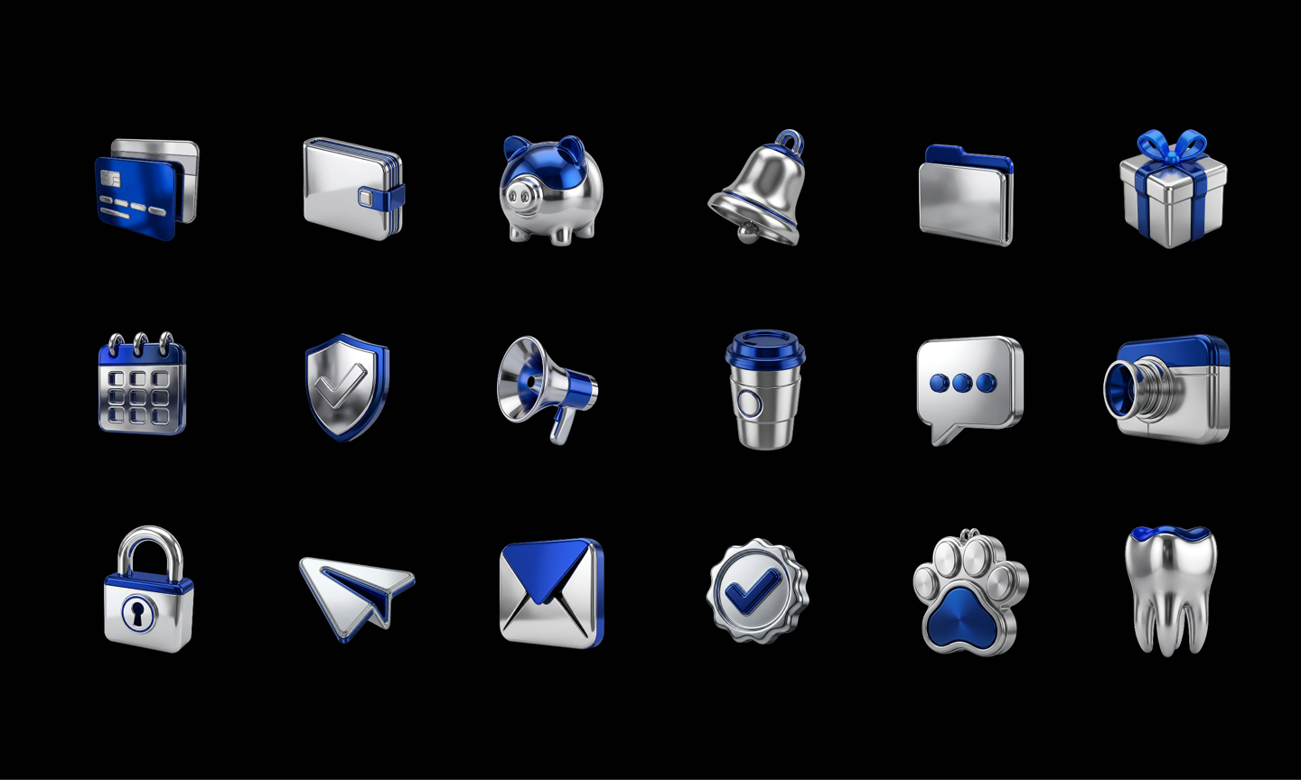
Having worked extensively in fast-paced environments, I always look for ways to make prototypes feel realistic without waiting for long production cycles. To elevate the experience, I used hand sketches, moodboards, and Higgsfield AI to quickly generate custom 3D icons and subtle motion assets aligned with AXA’s brand. While it doesn't replace a dedicated 3D artist for final production, this workflow allowed us to test realistic user reactions early and ship a polished MVP in a fraction of the time.
Archives
Retrospective: Evolving an intranet into an operational workplace
Working directly with AXA a decade ago, I designed their official internal app focused strictly on editorial reader needs. As shown in these archives, our client brief centered on content delivery, featuring rich article layouts, media galleries, and event signups. It contained no team management or HR utilities. Revisiting this official work for a personal redesign project gave me the freedom to evolve the concept, transforming a traditional news portal into an active daily workplace platform.


Takeaways
What redesigning this ecosystem taught me about AI, UX, and product evolution
AI excels at functional logic, humans excel at emotional resonance
AI is a great tool to work with and it gets me there faster, especially on the logic and the edge cases. It has no taste of its own, so I would not trust it with most of the creative work. Typography, pacing and brand are still decided by hand.
From reading the news to getting things done
In 2016, corporate apps broadcast news from the top down and people read it or did not. Today they come back daily because the app also holds their payslip, their leave and their expenses, next to the media.
Making "boring" corporate flows engaging
To turn HR tasks and corporate updates into something people open, I rethought the layouts. Interactive modes, audio and quick digests next to full reads, and custom 3D animations turn a chore into a daily habit.
Solo concepts vs real client constraints
On my own I can explore the architecture, experiment quickly and push the visuals without corporate friction. A real client project, like the 2016 build, asks for compromise, legacy systems and stakeholders to agree. This one shows what the experience can be without any of that.
The evolving design process
Prototyping in 2026 goes past Figma screens. I put visual polish, live-coded logic and generated assets like icons and motion in the same prototype, so I could test how it looks and how it thinks before production.
