
Iteration X
Co-founding, architecting and designing a contextual feedback ecosystem for tech, clients and product teams, from 0 to exit
Why this project matters
Building Iteration X from scratch was a major lesson in speed and focus. I designed the product from zero to 200+ clients, €4.7M raised, a $22M valuation, and a successful exit. Designing a tool with no existing model to copy taught me to make sharp product choices, balance quality with tight deadlines, and prioritize what truly drives survival and growth.





Context & Vision
Solving an industry-wide challenge: how fragmented communication between teams drains time, drops critical data, and impacts revenue
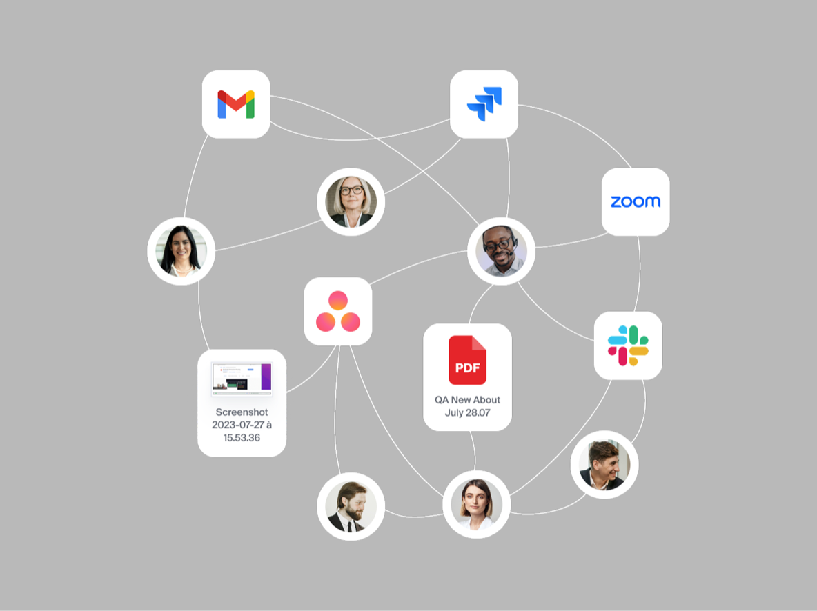
While running our agency, client feedback was a constant headache. Notes were scattered across emails, Slack, and PDFs, forcing us to waste hours taking screenshots and copying context into tools like Asana.
Constantly switching between apps meant losing critical details and precious time. Realizing this friction costs teams hours every week, we decided to build our own solution to fix feedback loop once and for all.
Phase 1: The extension
How a simple browser extension secured $5M by making feedback effortless
Why write a bug report when you can just point and comment?
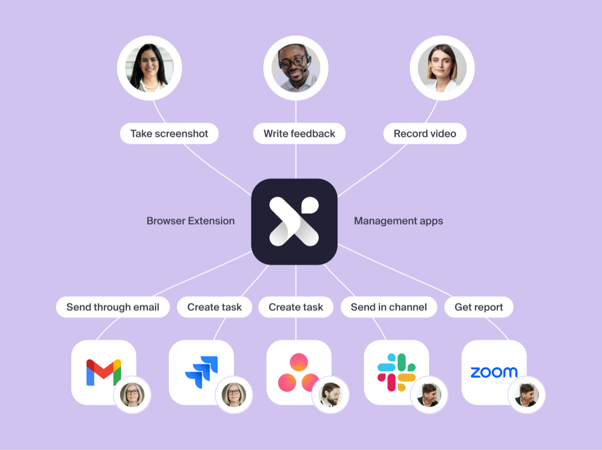
Rather than forcing users to manually detail bugs, our extension captures the entire environment as they work. It automatically logs DOM metadata, viewport specs, OS data, and console output directly on the live product.
To avoid manual bug reports, I designed a simple extension flow that lets guests point, comment, and resolve issues directly on the live page.
The design challenge
Navigating the unknown to build a non-intrusive UI
Since no benchmarks existed in 2021, we went through 5 to 6 major design iterations. Designing a modular overlay meant handling web environments we had zero control over: avoiding content collision across unpredictable viewports, keeping crucial underlying UI elements visible, and ensuring the interaction remained faster than logging a task in Asana or Jira.
Our biggest early mistake
How an extension-first architecture blocked adoption and stalled growth.
We crammed our entire product into the browser overlay: live DOM node mapping, issue tracking, project spaces, notifications, and granular roles. Requiring a plugin install just to review a single issue created a massive wall for external clients, guest reviewers, and mobile users. Static email workarounds couldn’t scale, crippling our viral sharing loop and forcing an architectural shift toward a web-accessible ecosystem.
The First Pivot
Turning the extension into a dedicated capture tool while moving project management to the dashboard
To move beyond one-off redesigns and become a daily workflow, we built with my cofounders and the engineers a web platform for project management while focusing the extension purely on capturing live feedback.
What to keep & to fix
The goal was to scale the platform without losing its core speed: preserving effortless feedback sharing for clients without mandatory plugin installs, while removing the rigid extension requirements on mobile and isolated public pages that previously blocked collaboration for larger teams and complex projects.
The main goal
Scaling web project management without sacrificing the fast, simple live captures and context that made Iteration X unique in the first place.
Phase 2: The dashboard
Evolving from a constrained overlay to a high-density workspace for an optimized feedback loop
The main challenge was losing context. Static task boards disconnect bugs from the live product, forcing teams to context-switch when reporting issues and reviewers to waste time figuring out where they actually happened.
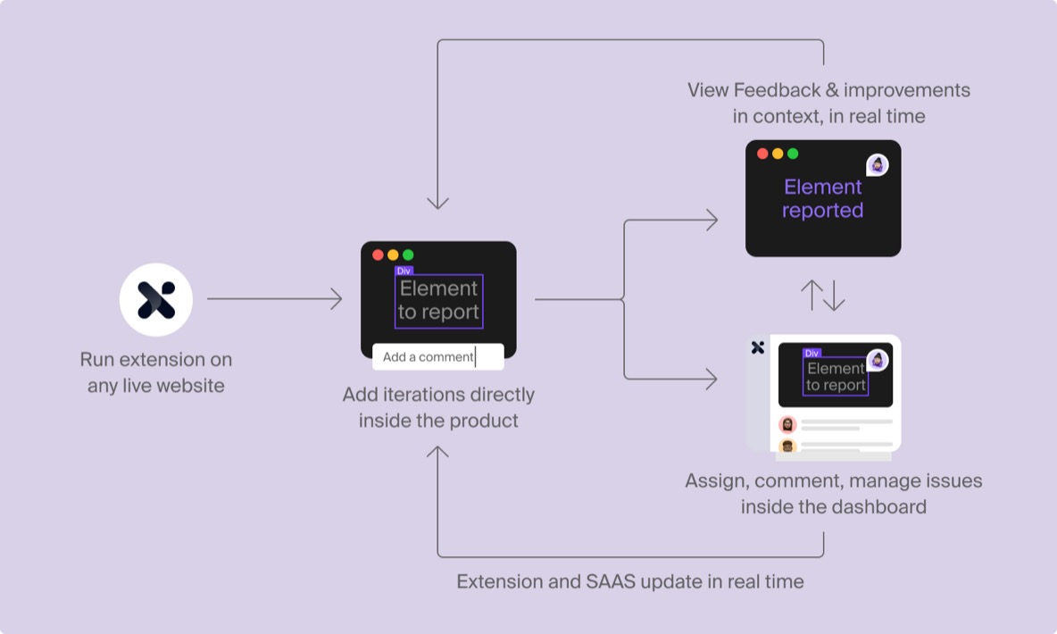
A zero-friction, bi-directional loop
Working closely with engineering, I designed a real-time two-way sync between the extension and the dashboard. As shown below, reporting a bug directly in-product automatically links to its dashboard ticket, and vice-versa, keeping developers, PMs, and clients aligned.
Architecture
Structuring issue navigation around depth, focus, and collaboration
To accommodate different working styles across product teams, we designed a flexible view architecture. By separating quick issue triage from deep debugging and external client alignment, each view mode serves a specific operational depth without cluttering the interface.
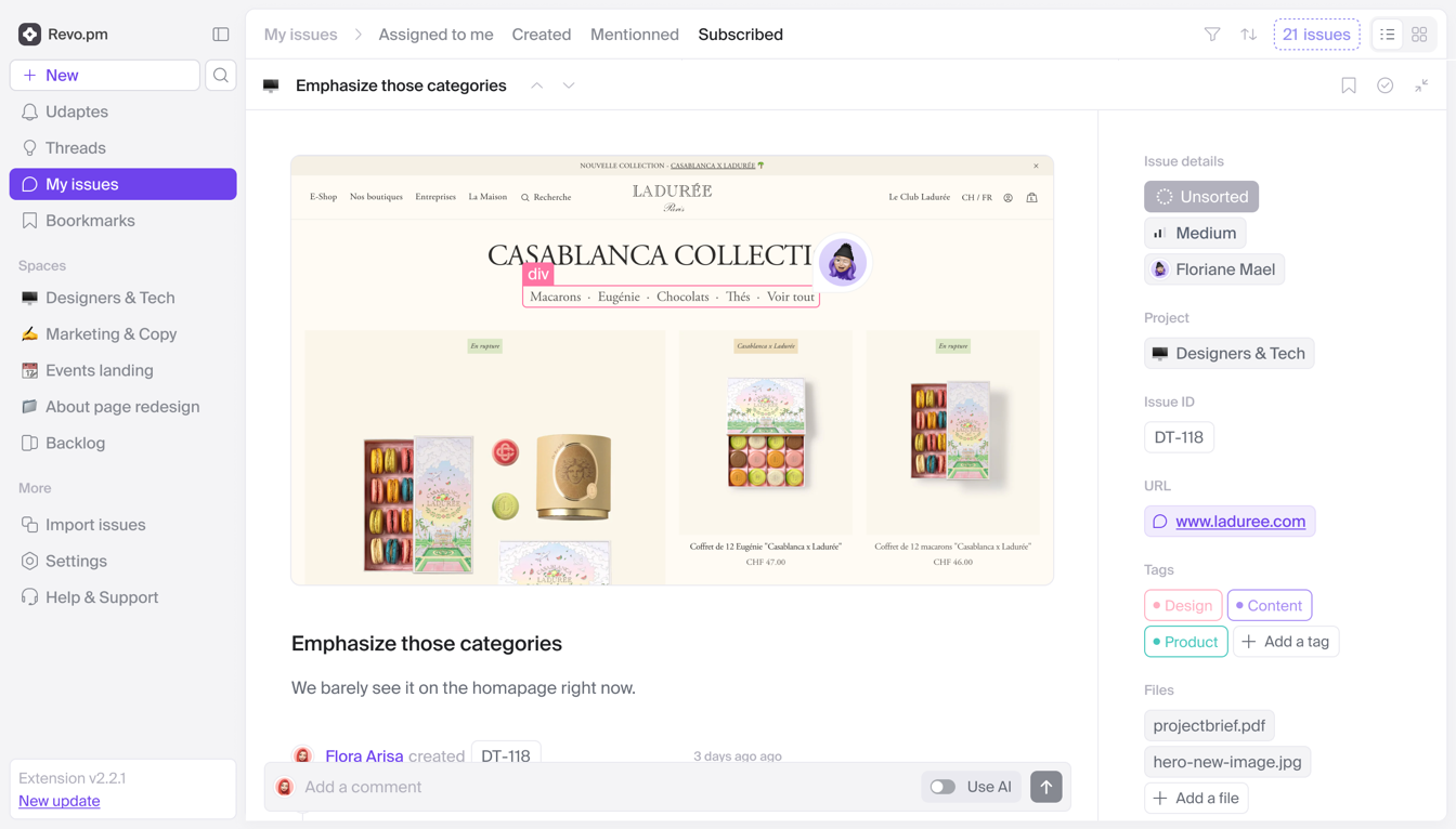
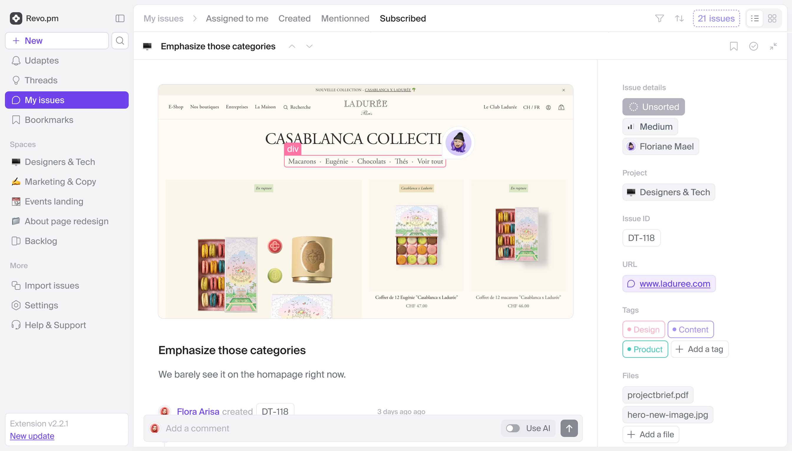
Project management
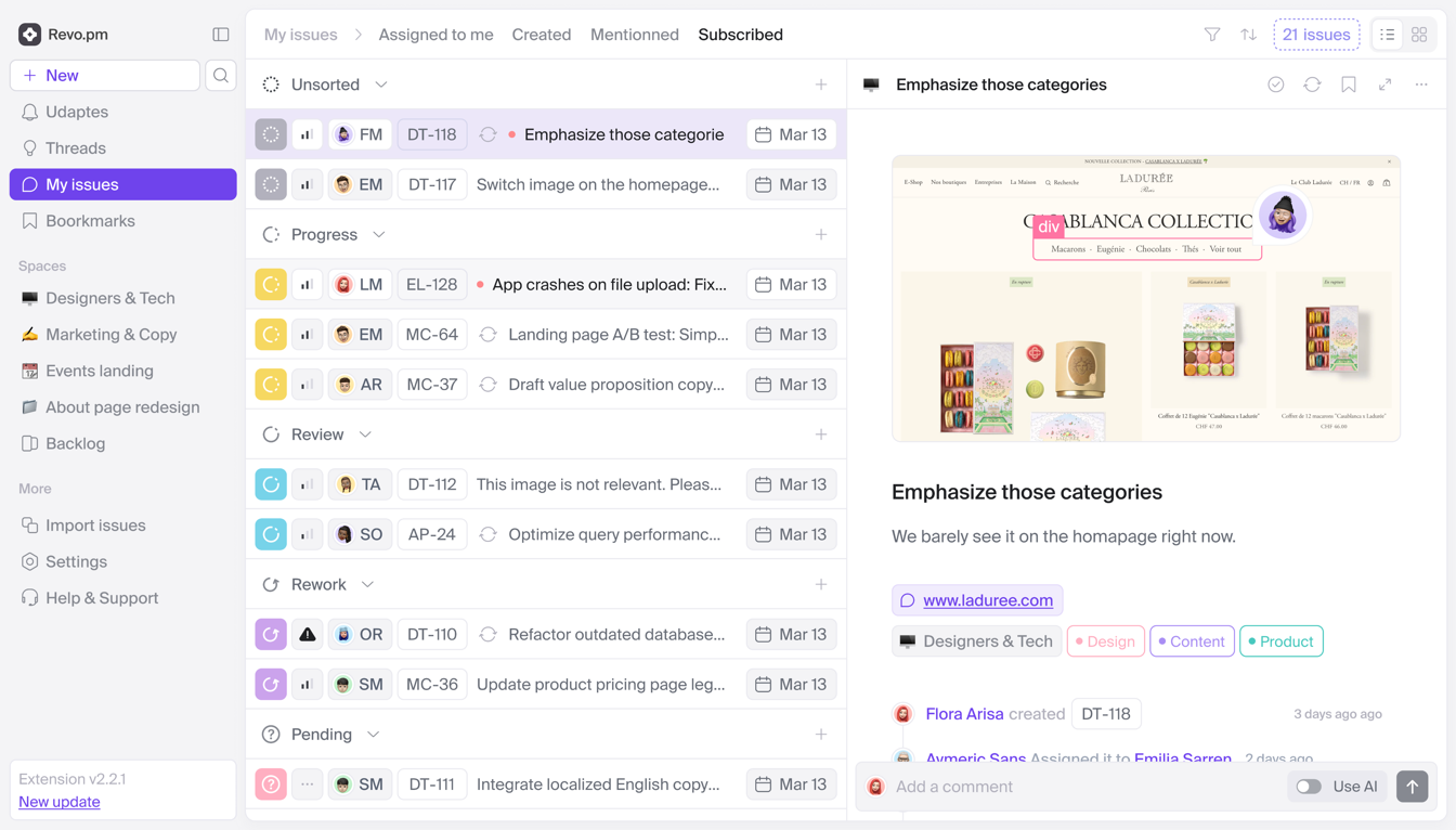
At this stage, I also had to manage high-density issue lists with many settings and layers.
As client’s teams size and issue volume grew, we introduced a structured triage system with custom tagging. Fitting status, priority, ID, assignee, tags, creation date, sync status (Jira/Linear), and capture source (extension vs. web) into a single row required a tight UI balance.
Beyond row mechanics, we had to solve list-level complexity.
Making heavy project data actionable at a glance
It combines advanced filtering (project, priority, deadline, tags) with a strict metadata hierarchy and real-time update states, keeping complex data readable and actionable at a glance without cluttering the UI.
Modular issue panel
Building a scalable and modular layout template that adapts to any company’s issue type, media and content
A visual bug report isn’t structured like a feature request. Rather than building rigid templates for every edge case, we created a modular layout system that dynamically shifts data density based on attached assets, ensuring critical information remains readable at a glance.
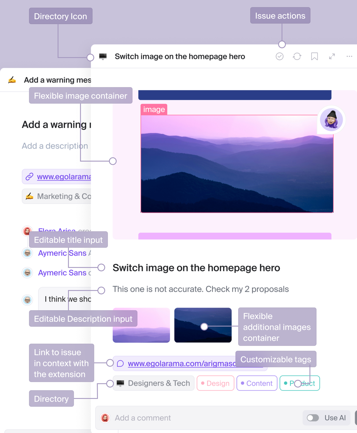
Structuring content across edge cases
I designed a flexible card layout that handles all levels of content density without cluttering the screen. It smoothly combines live web captures with rich-text notes, adapts its hierarchy when users attach heavy videos or multiple tags, and keeps long comment threads clean so teams can easily track their history over time.
User Permissions
Designing role-based interfaces that power our business tiers
Product teams operate in complex ecosystems with internal members, freelancers, and external clients. Collecting feedback requires opening up access without compromising sensitive project data.
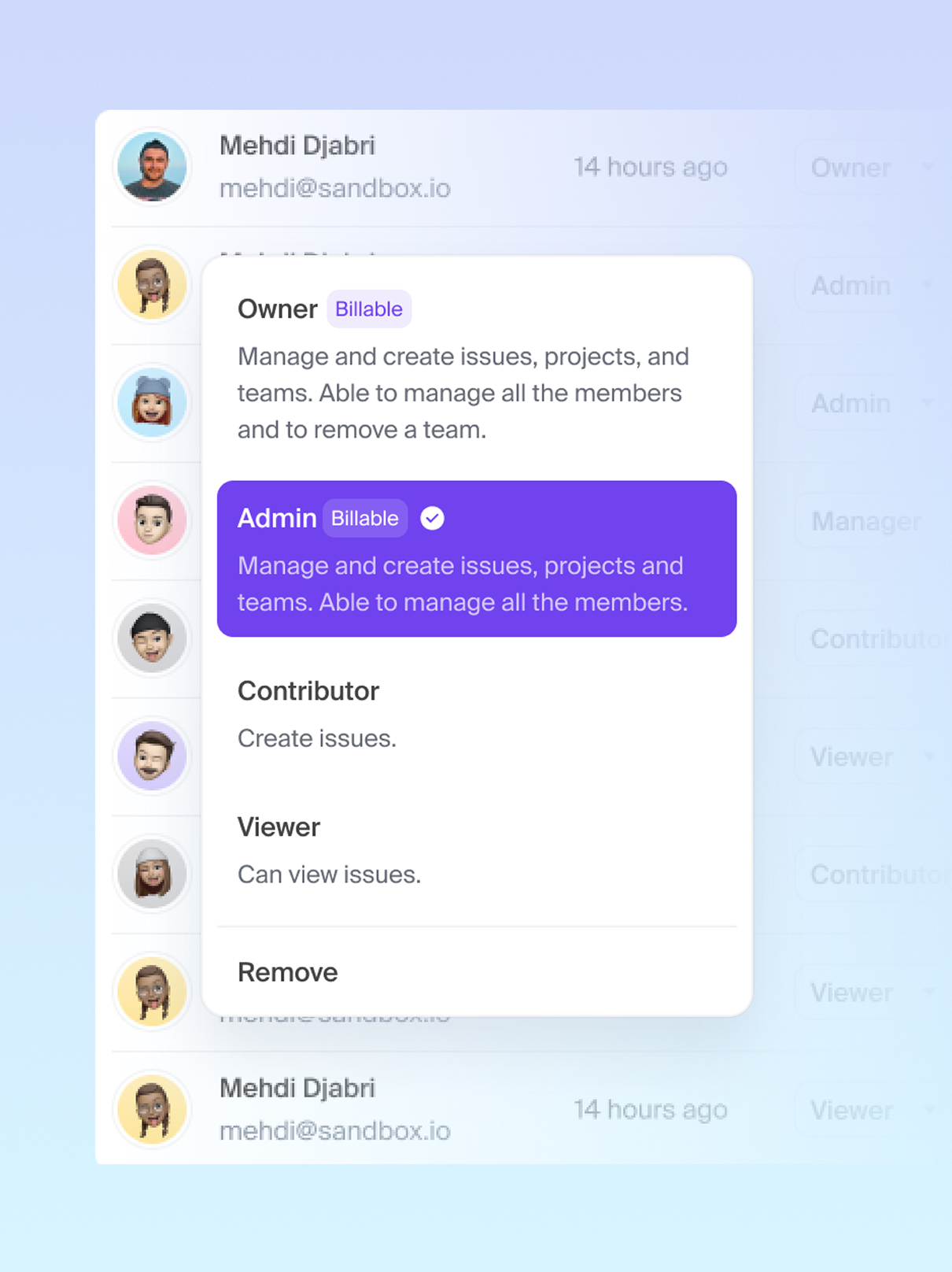
Structuring boundaries for clients and teams
I designed every feature with role-based access in mind to balance security, business goals, and user needs. Workspaces are segmented to keep external client feedback separate from internal discussions, while critical management actions like inviting or modifying members are restricted to authorized roles to prevent scope creep.
Notifications strategy
Turning Notifications into an Engagement Engine: The Shift to a Modular Home Feed
Tracking project progress across teams is hard when updates are hidden inside detailed technical tickets. We noticed that notifications were actually the main way PMs, clients, and team members stayed up to date. People didn’t want to dig through complex boards; they just needed a quick, reliable summary of what changed.
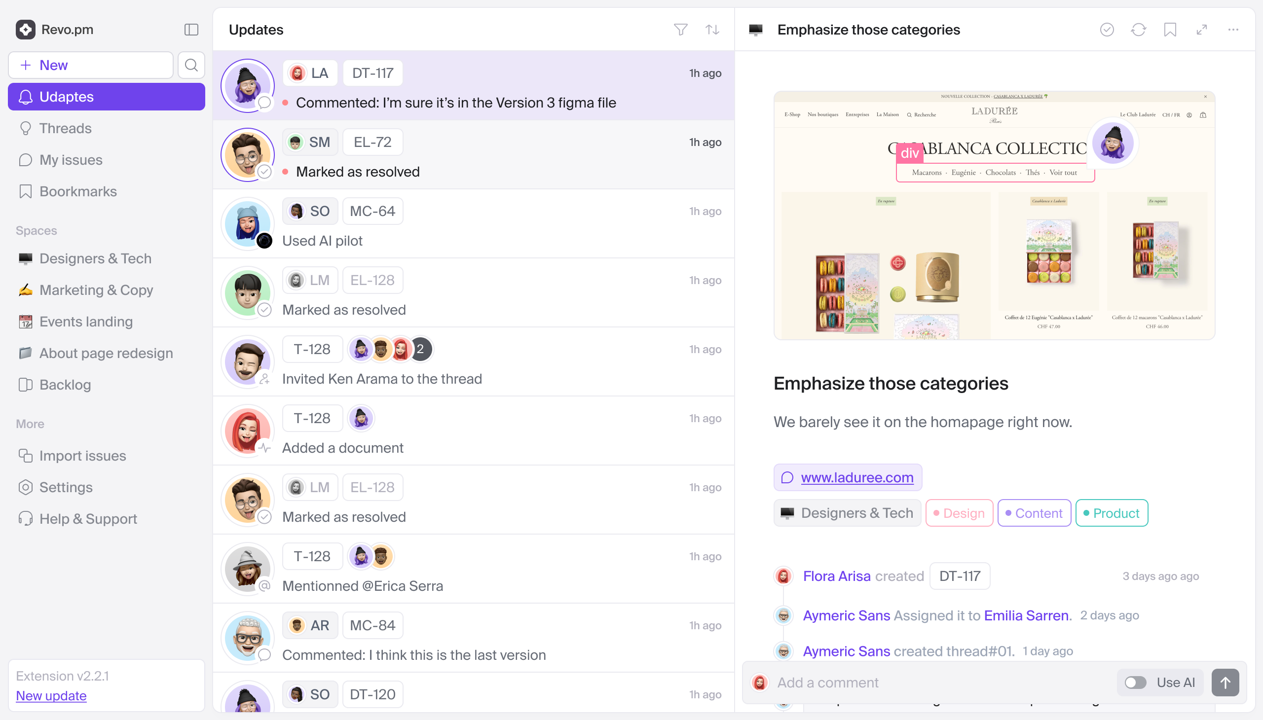
Upgrading existing notification patterns instead of adding feature clutter
To simplify project tracking, I turned standard notifications into a standalone Home inbox. This central feed gathers all updates, comments, and feedback into a single stream that automatically adapts to each user’s role, whether they are a PM, team member, or external client. By replacing complex project boards with an intuitive view, it opens the product to non-technical users, provides direct access to live progress, and eliminates the need for manual status meetings.
Universal search
Solving product complexity: designing search as a universal shortcut for both new joiners and power users
As Iteration X evolved into a powerful, feature-rich platform, the product naturally gained depth. With advanced capabilities nested across workflows, guiding users through every layer became time-consuming: live demo calls were stretching out, and traditional onboarding couldn’t do justice to the platform’s full scope.
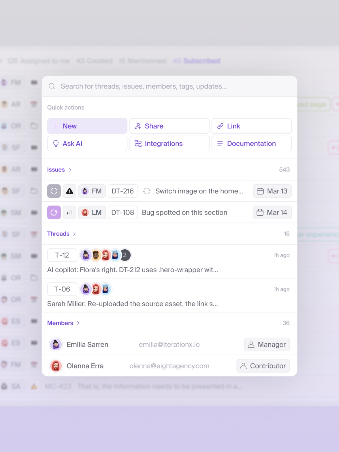
Evolving search from basic lookup to an active command center
Building traditional onboarding tutorials was consuming too much time for our team with little value. To eliminate this overhead, I collaborated with engineering to turn global search into an active shortcut instead of passive walkthroughs. By embedding documentation and quick actions into the query window, we enabled users to learn on demand within their workflow, saving core resources while cutting support tickets.
Step 3: The mobile app
Answering user demand without slowing down the roadmap of our core product
As mobile usage grew, users increasingly needed to manage and report issues directly from their phones. However, our desktop layout relied on deep nested menus and side-by-side views. Fitting that complex experience onto a phone screen without creating a slow, multi-tap process was a tough UX challenge.


UX decisions
Rethinking our mobile UX: turning deep navigation into active feeds
Our desktop layout uses deep nested menus and side-by-side views. Packing all that data onto a phone screen without creating a slow, multi-tap experience was tough.
The UX Pivot
Instead of forcing users to click through endless folders on mobile, I flipped the architecture by grouping content by type. Issues, updates, and threads now surface in clean, aggregated feeds right at the top. The outcome is a fast, focused app built around two core jobs: reviewing updates in seconds and drafting new issues on the go, while leaving complex management on desktop.
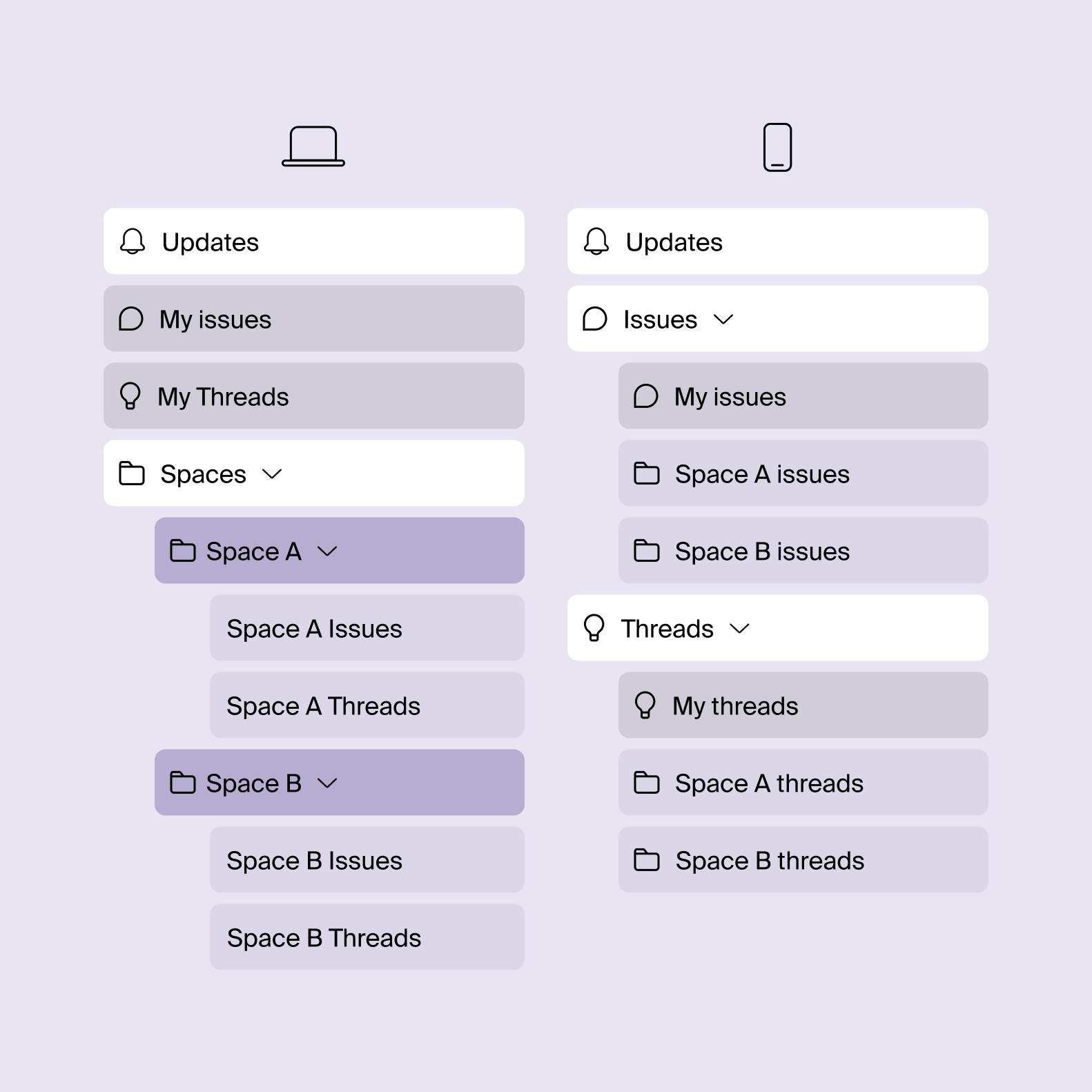
Issue preview on mobile
Structuring complex issue metadata for instant mobile readability
Losing desktop split screens and expanded side panels created a tough layout challenge: how to condense complex metadata and deep discussion threads into a single phone view without sacrificing speed or context.
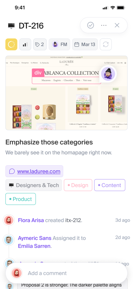
Designing an issue preview built for thumb navigation
I condensed complex desktop issue views into a contextual bottom sheet tailored for mobile screens. To prevent endless scrolling, critical metadata is placed in a horizontal chip carousel directly below the title, remaining pinned whenever users scroll up. Since mobile lacks hover states, key actions like attachments and mentions are integrated directly into a sticky input bar, surfacing dynamically as soon as typing begins.
Step 4: The AI engine
Moving beyond standalone chats: An AI assistant built directly into project tasks, documents, and team history
Our product was already capturing live UI states, technical data, and discussion threads, giving us a rich, structured knowledge base. With AI becoming a standard expectation in modern SaaS, leveraging this history allowed us to help teams spot recurring bugs and retain project knowledge effortlessly. Beyond product value, this initiative created a strong narrative to boost brand awareness and provided rich material to lead interactive workshops with clients and community events.
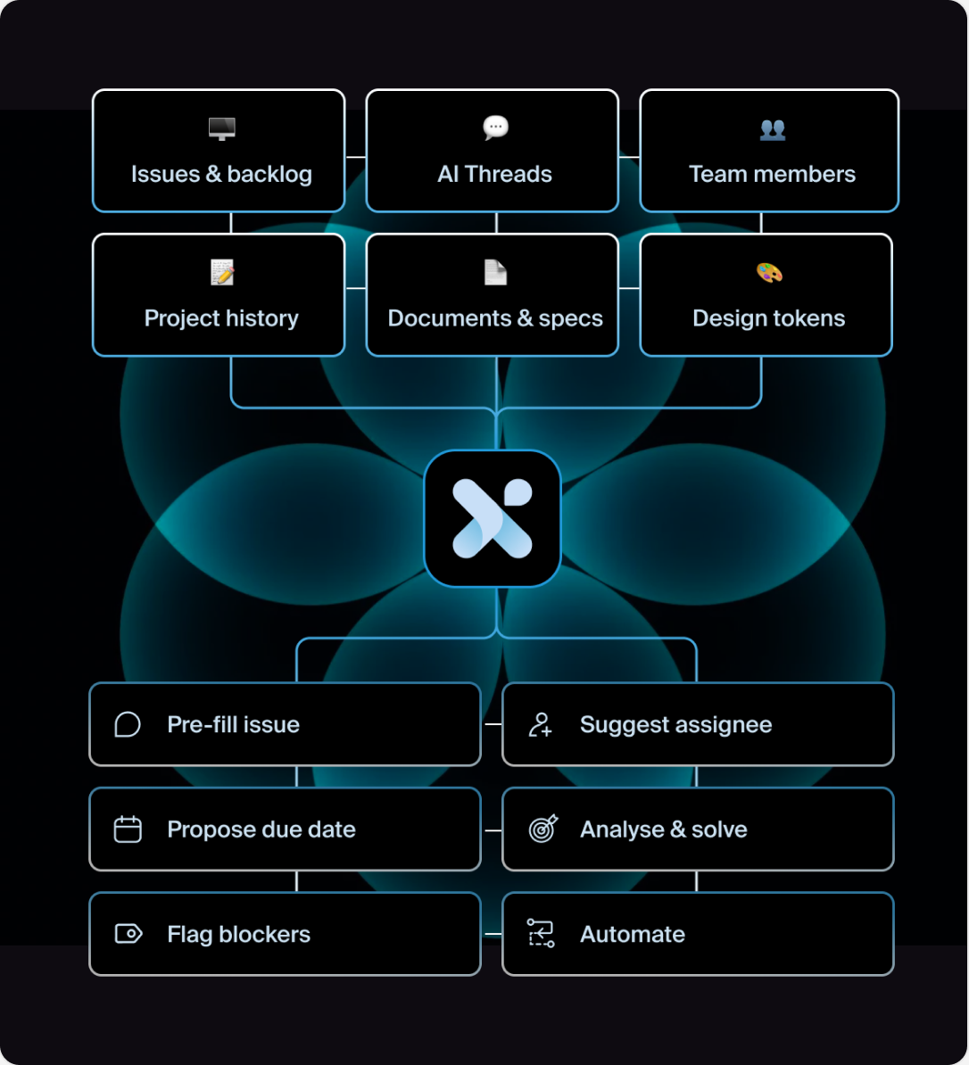
Skipping the AI hype to build a true workflow intelligence
Rather than chasing the AI hype with a generic sidebar chatbot that frustrates users with prompt fatigue, we wanted to leverage our existing project data to deliver instant, context-aware answers right where teams work.
Cross-work agent
Turning passive issue tracking into proactive AI assistance
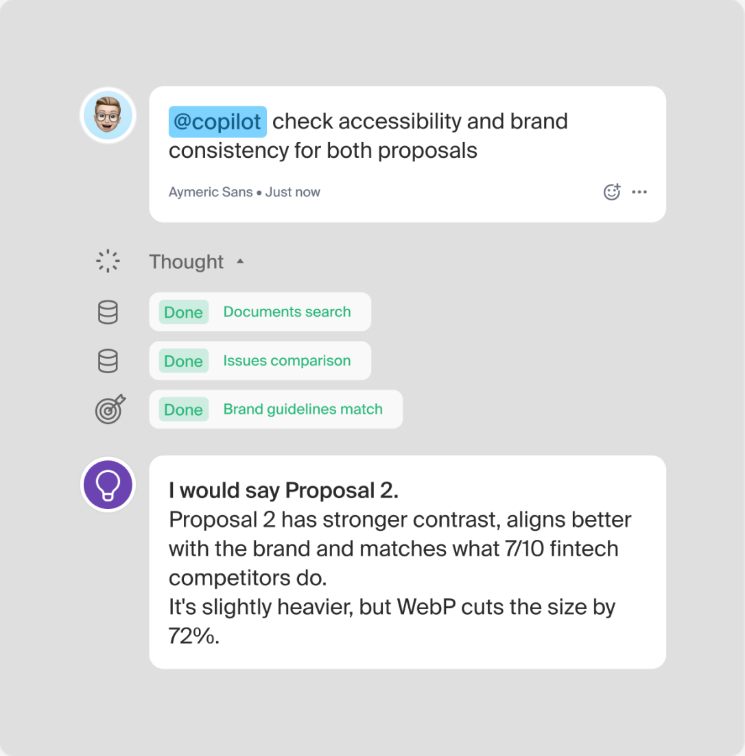
Rather than using AI for generative tasks, we made a conscious architectural decision to direct AI toward system refinement. We focused on high-impact workflows around existing work: cross-checking issue history, spotting priority anomalies, and clarifying dependencies. This strategic prioritization turns raw project data into actionable insights while avoiding the bloat of unnecessary generative features.
What we proposed
We wired the AI directly into the project data model, including tickets, specs, design tokens, and comments. Instead of an isolated chat window, the copilot works directly inside the UI to pre-fill tasks, assign team members, flag blockers, and answer questions based on the full history of the project.
Adaptative AI
Adapting AI interactions across flexible dashboard layouts
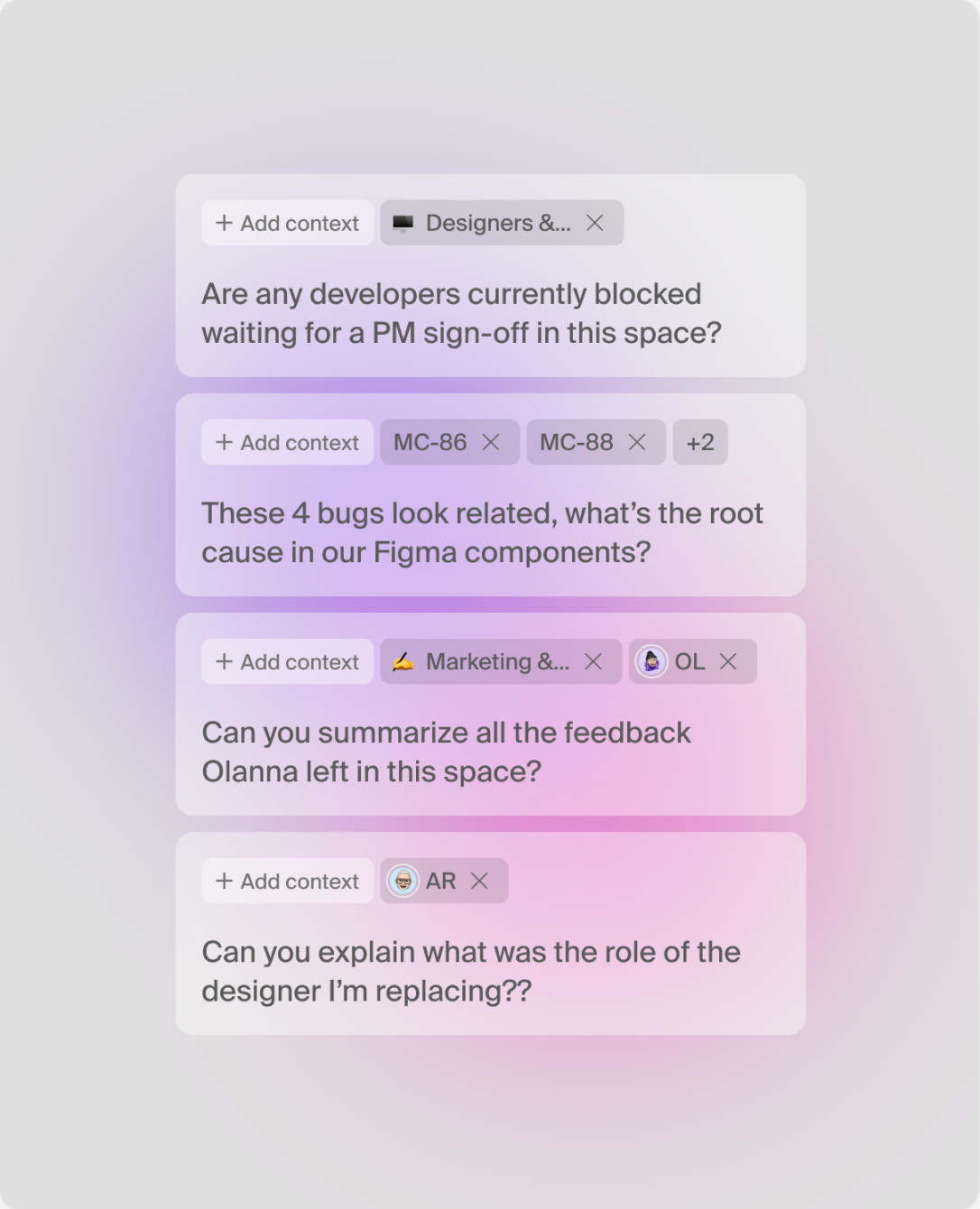
I designed the Copilot to fit seamlessly into the dashboard’s split views and modal states, allowing users to summon AI assistance without losing context of their active tickets. The main challenge was maintaining a coherent experience across different layout modes, from side-by-side issue inspection to floating panel conversations. By introducing contextual prompt templates and clear parsing indicators, the system adapts dynamically to available screen real estate, turning complex team data into clean, structured digests right where users need them.
Brand identity
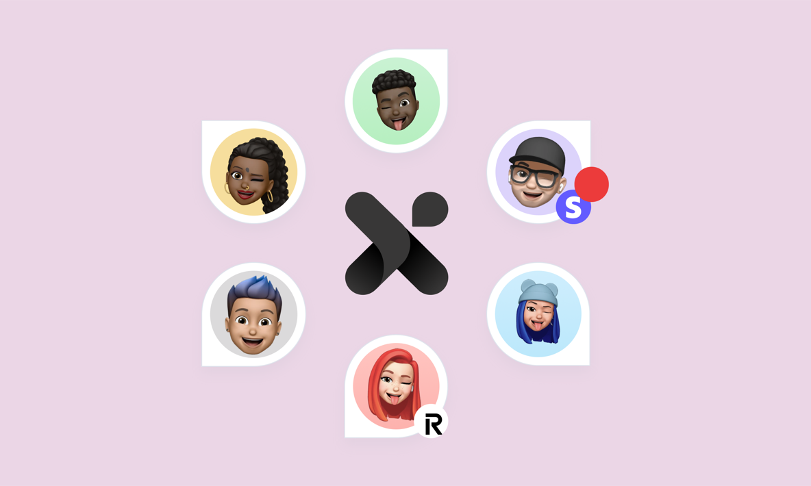
Designing an inclusive identity to humanize technical collaboration
Developer tools are usually cold and rigid.
Since Iteration X connects developers with designers, PMs, and clients, I designed a brand identity that bridges both worlds.
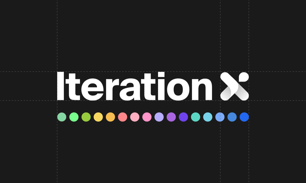
I balanced a structured logomark with a vibrant color palette, keeping the product grounded in technical credibility while making marketing touchpoints warm, welcoming, and accessible to non-technical teams.
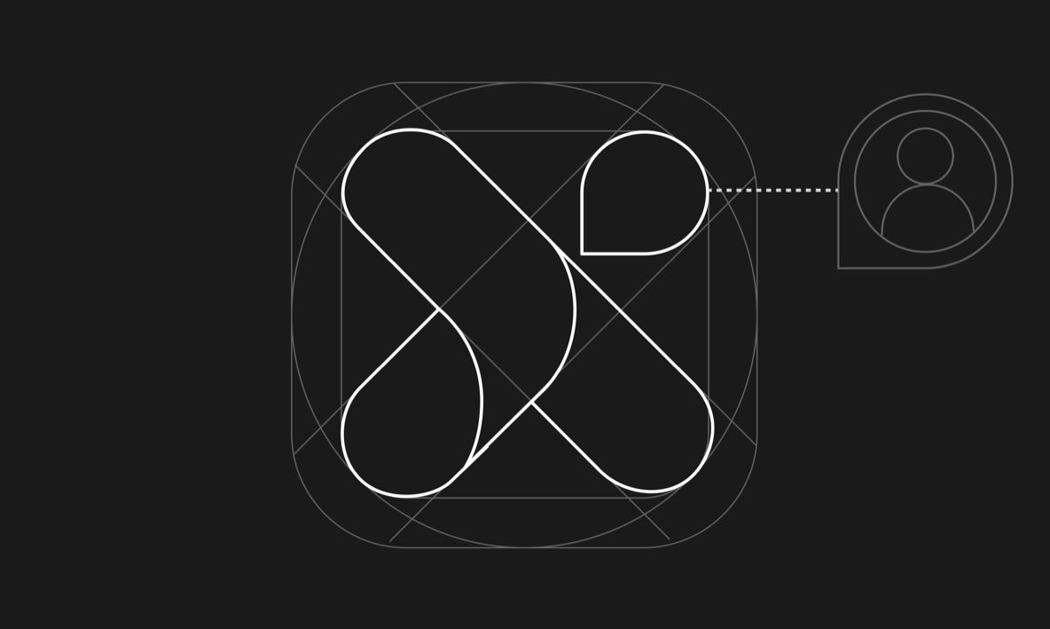
The “X” logomark is engineered on a strict geometric grid, fusing three core collaboration primitives: a cursor, a feedback comment bubble, and an intersection point.
Takeaways
What I learned by building the startup Iteration X goes far beyond digital product design and client management.
Designing custom solutions vs. scalable UX
We sometimes over-designed complex workflows for a single client who eventually churned. This created bloated interfaces and diverted us from solving core user problems. It taught me that UX decisions must serve scalable patterns rather than edge-case client requests.
Design velocity and team morale
Watching complex flows and interfaces get discarded demoralized the team after weeks of intense design and dev effort. Balancing fast iterations, user testing, and quality craft requires knowing when to ship a lightweight prototype before committing to full high-fidelity designs.
Pricing strategy in feature development
Early on, we prioritized adoption and retention over monetization. We overlooked how features fit into our pricing plans, missing opportunities to convert users. Scalability and business logic must be baked into every feature from day one.
Managing design system and tech debt
Moving fast to stay competitive led to shortcuts in both code and design that required costly refactoring later. Focus on perfecting a few key features to test a concept rather than expanding prematurely, which inflates maintenance and communication costs.
Product design goes beyond UI
Design is about solving core problems, not just drawing interfaces. Sometimes the best solution isn’t adding a feature or tweaking a flow, but introducing a human touchpoint or removing a feature altogether. Intent always matters more than form.
Cross-team communication is vital
Under high pressure, team members occasionally made isolated decisions, causing alignment friction. I committed to radical transparency and setting ego aside to keep the team cohesive.
Design cannot exist in a silo
Every feature must account for engineering constraints and marketing goals. Cross-functional alignment is essential to build a cohesive product.
Leverage proven patterns over reinventing the wheel
To flatten the learning curve, I adopted established mechanics from mature products. Unnecessary originality costs resources; leveraging tested patterns drives faster adoption.
Beware of FOMO & hype-driven design
Adopting trends or forcing AI into every feature adds unnecessary complexity with hard-to-measure ROI. Unless a feature is immediately vital, it is better to validate market demand before committing resources.
Product success requires balancing tech, people, business, and timing
The hardest part of building is aligning these key elements while managing their trade-offs. Great UX elevates a product, but it can’t drive success on its own. Getting the timing right and keeping everything in sync is what actually makes or breaks a project.
Investors & press
Throughout this journey, we’ve been privileged to be supported by exceptional investors, advisors, and partners
Investors
La Famiglia Ventures(pre-seed investment)
Connect Ventures(seed investment)
Diaspora Ventures(& private investors (seed investors))
Contentsquare(accelerator)
Advisors
Thibaud Elzières(Folks, eFounders)
Jonathan Anguelov(Aircall)
David Okuniev(Typeform)
Jeremy Le Van(Sunrise)
My sincere gratitude to all the other investors, advisors and collaborators who contributed to our journey.
Press
Why Connect Ventures backed Iteration X(Pietro Bezza, our investor)
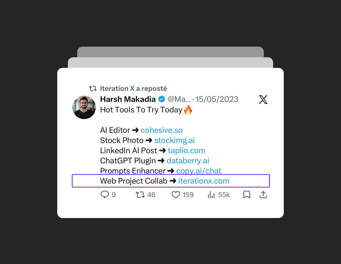
Iteration X raises $4.7M to bring collaboration into live products(Tech.eu)
Iteration X launches with a $4.7M seed round(The Saas News)
Launch in 2022(Product Hunt)
Launch in 2024(Product Hunt)
