
PropertyGRID
Establishing institutional trust for tokenized real estate
Why this project matters
I joined PropertyGRID as a partner to make buying real estate with crypto simple and trustworthy. My job went way beyond interface design. I helped build the business from the ground up: creating the pitch deck to raise our first funding round, and designing a marketplace that brought in both property sellers and buyers. It taught me to design for business growth, not just screens, acting as a real partner focused on making the company succeed.





Context
Leveraging blockchain to build a new asset class and open 1% investments to everyone
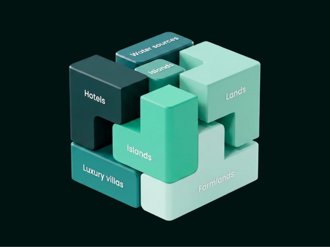
Real estate has seen little technological innovation compared to other markets. PropertyGRID changes this by enabling fractional ownership of high-value assets that were once reserved for ultra-wealthy, well-connected investors. Powered by RWA tokenization and blockchain technology, the marketplace bridges the gap between Web3 innovation and institutional-grade real estate.
Brand & positioning
Before building the prototype and platform, we first had to align the brand with the right audience
From crypto clichés to luxury real Estate: when I joined, PropertyGRID relied on stereotypical crypto/blockchain aesthetics: purple tones, neon green, and tech-heavy shapes. To establish credibility with institutional investors and luxury real estate professionals, I advocated for a complete brand repositioning before jumping into product design. Defining a trustworthy identity was essential to clearly communicate our vision, audience, and value proposition from day one.
Winning traditional investors with a private banking aesthetic
PropertyGRID looked too much like a risky tech tool, which turned away traditional real estate investors. I simplified the visual identity to match private banking standards, focusing on trust and clarity. The new logo combines Web3 hexagonal shapes with a simple roof line, keeping the tech background while looking safe and professional for big investors.


Marketplace & properties
Building the PropertyGRID Marketplace, from 0 to 1
When launching a brand-new marketplace, you face a double hurdle. Introducing a novel Web3 concept without confusing users, and dealing with a limited initial inventory. At launch, we simply couldn’t compete with the massive volume of listings seen on long-standing platforms.
One marketplace for two very different types of investors
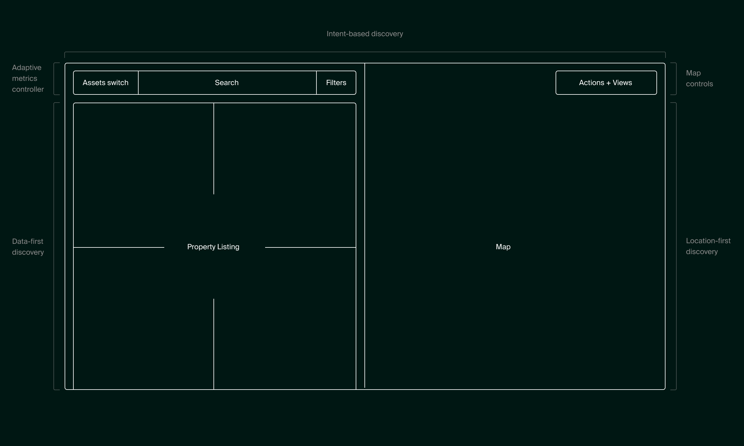
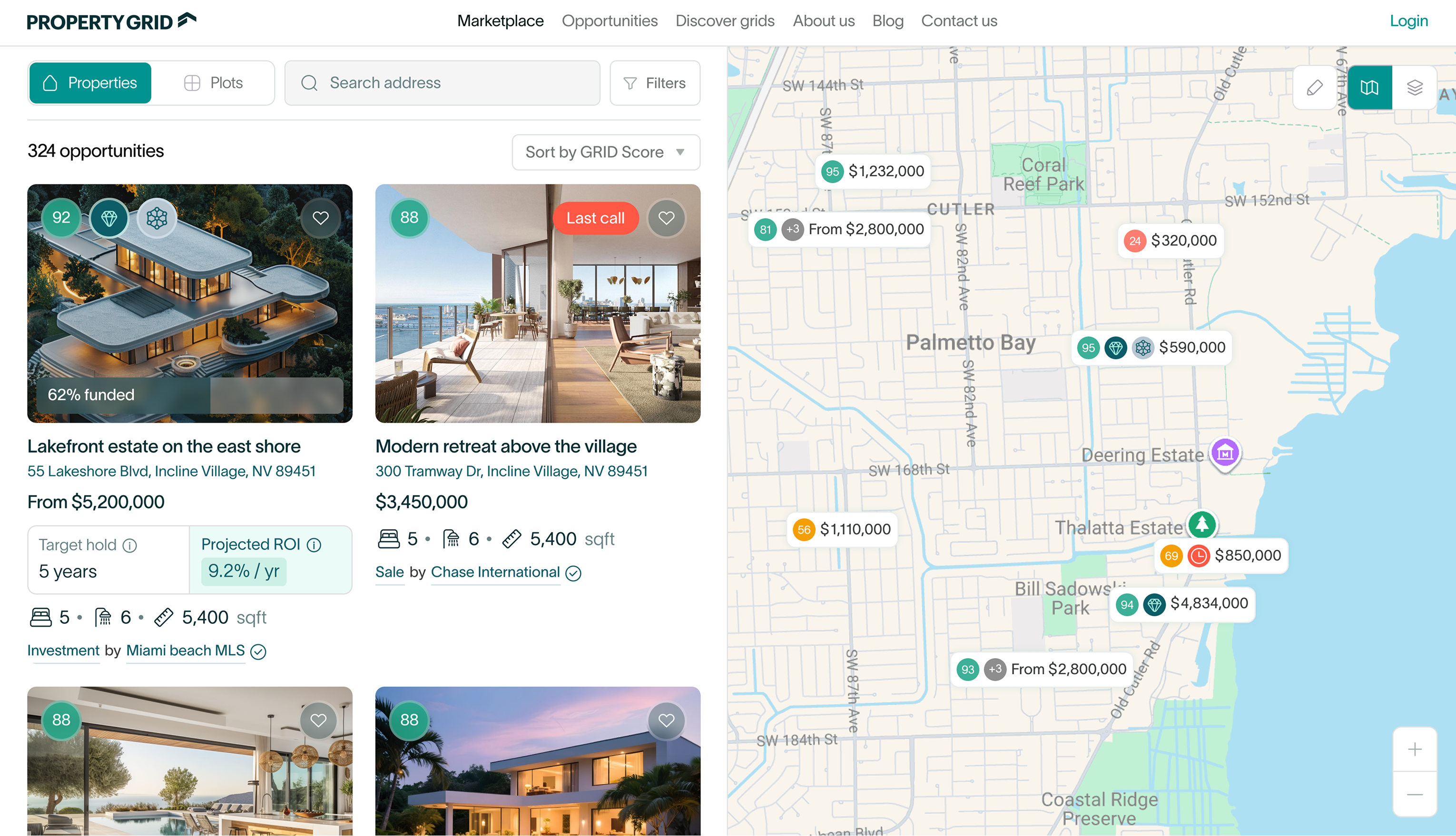
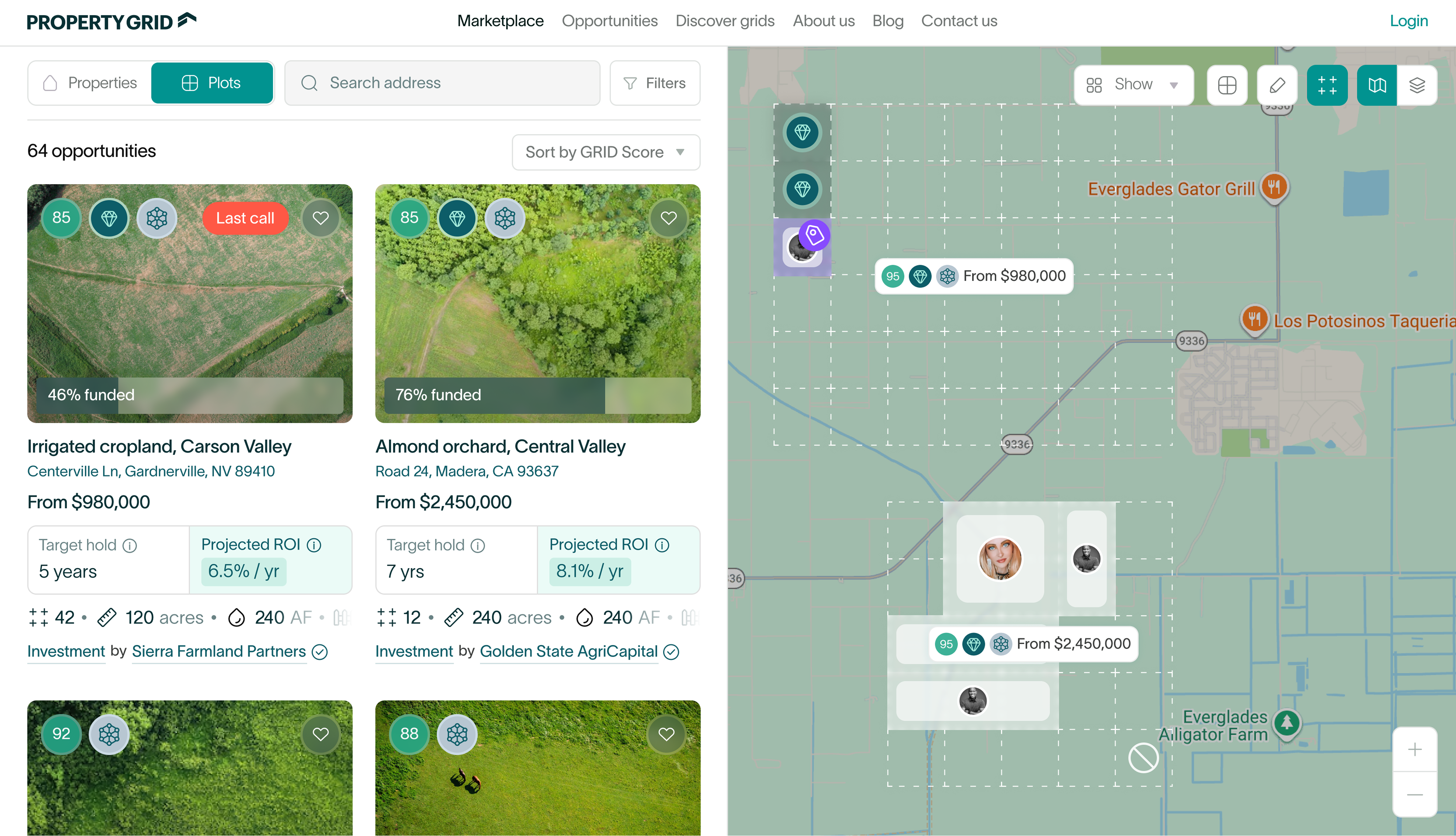
Investors browse differently depending on what they want. Some look for key numbers, while others search by location. To serve both fractional and whole-asset buyers, I paired a data-rich list on the left with an interactive map on the right. This lets users compare financial metrics or explore areas visually without ever losing context.
Responsive
Bringing a complex split-screen layout to small screens
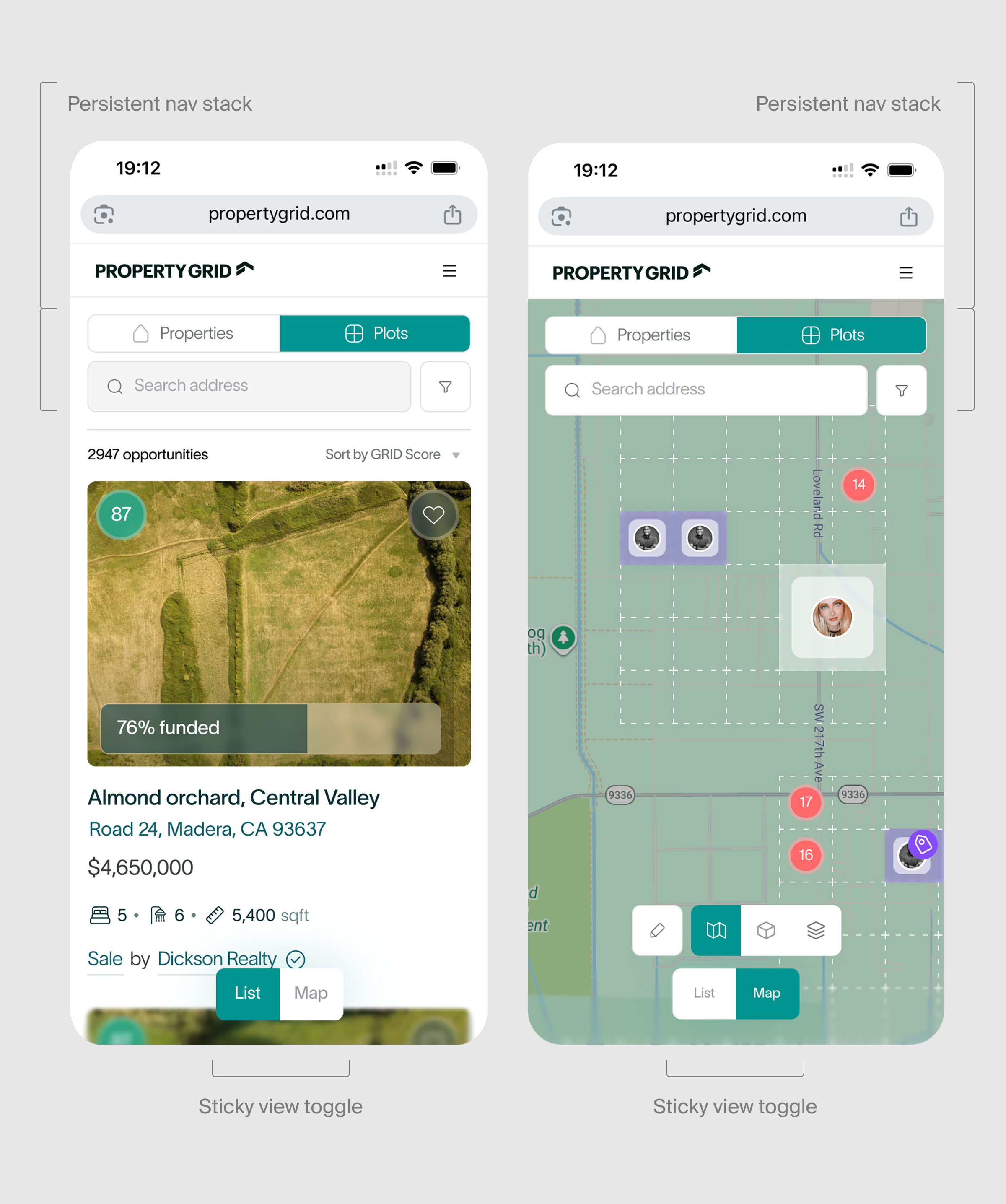
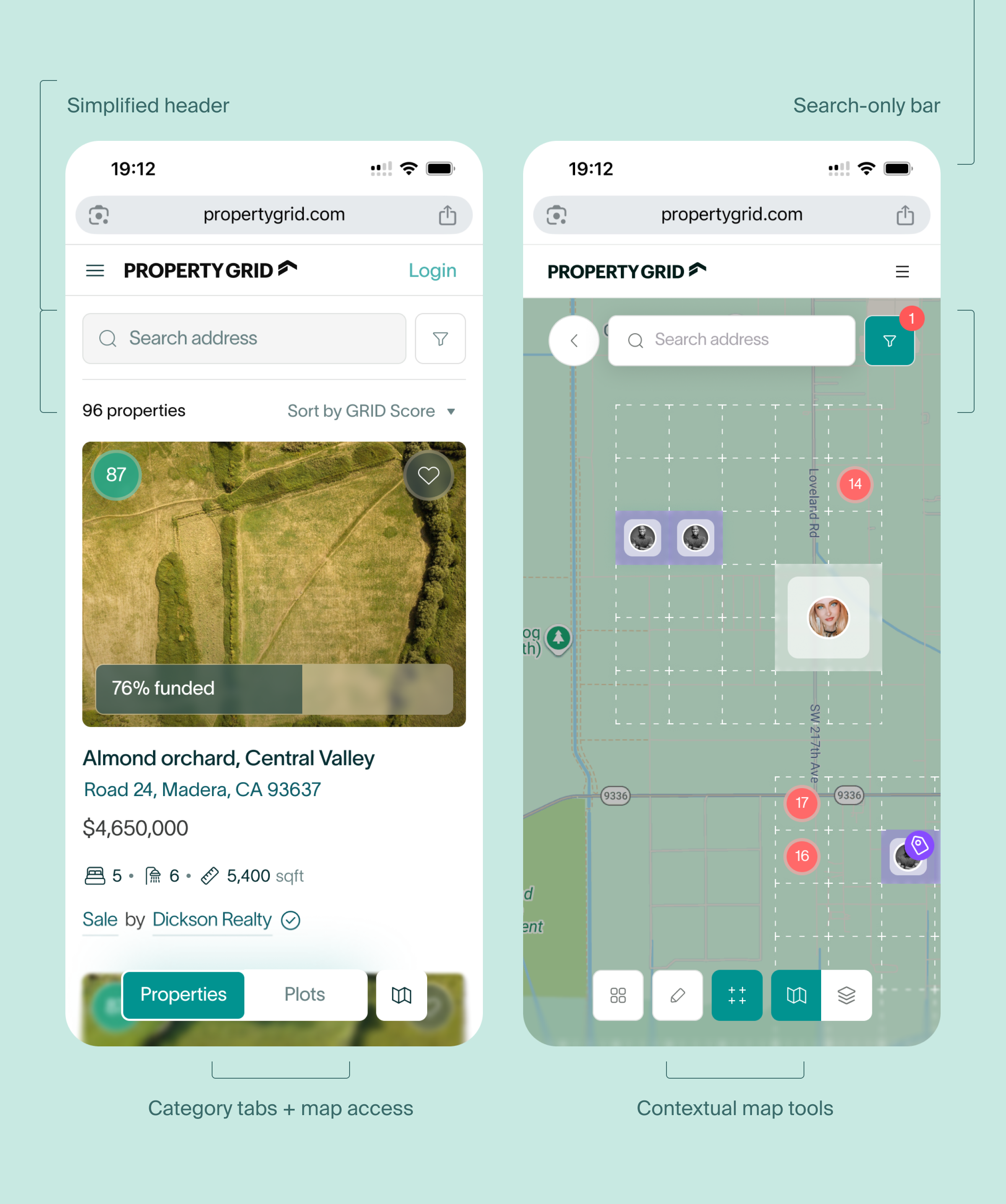
Squeezing a desktop split-screen map and dense filters into a phone usually leads to tiny touch targets and a cluttered screen. Instead of just scaling things down, I redesigned the experience around one-handed use. By using focused full-screen views and keeping core controls right under the thumb, users can easily scan market data on the go without feeling overwhelmed.


Designing for the thumb, not just a smaller screen
Instead of shrinking the desktop layout, I restructured the experience around single-handed ergonomics and progressive disclosure. By isolating primary tasks into focused full-screen states and keeping primary controls strictly within thumb reach, the mobile UI delivers a fast browsing experience that feels native to touch while keeping complex market data easily accessible.
Modular asset listing
One flexible system for all investment types
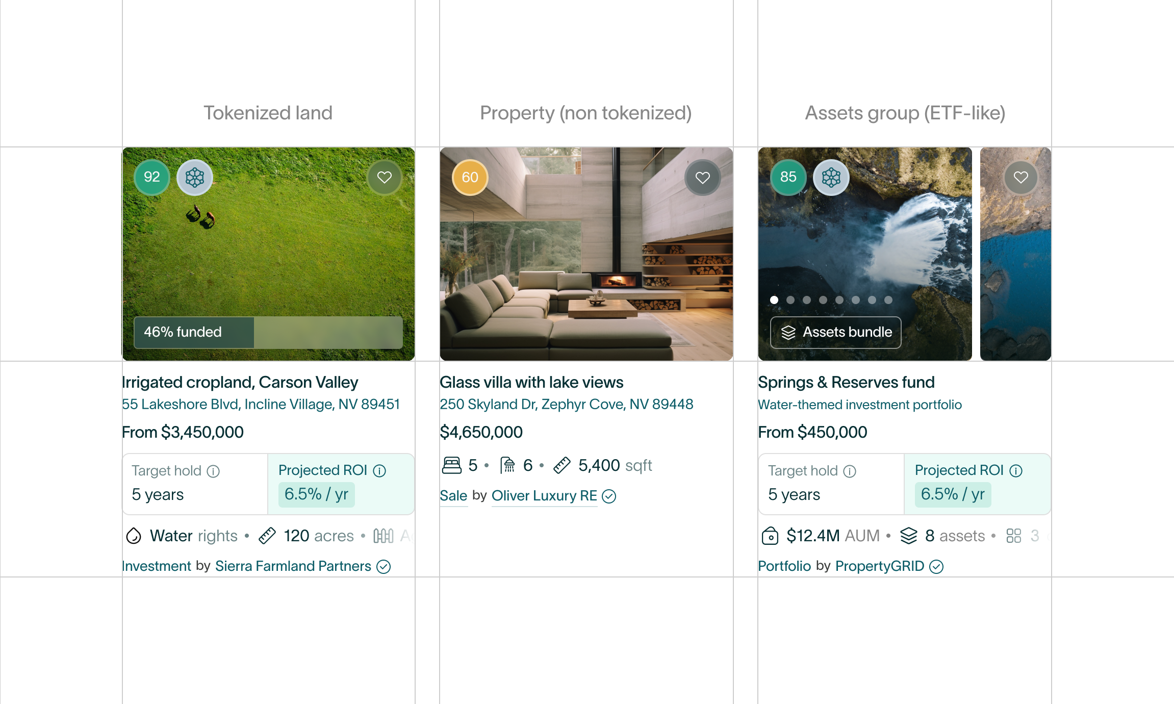
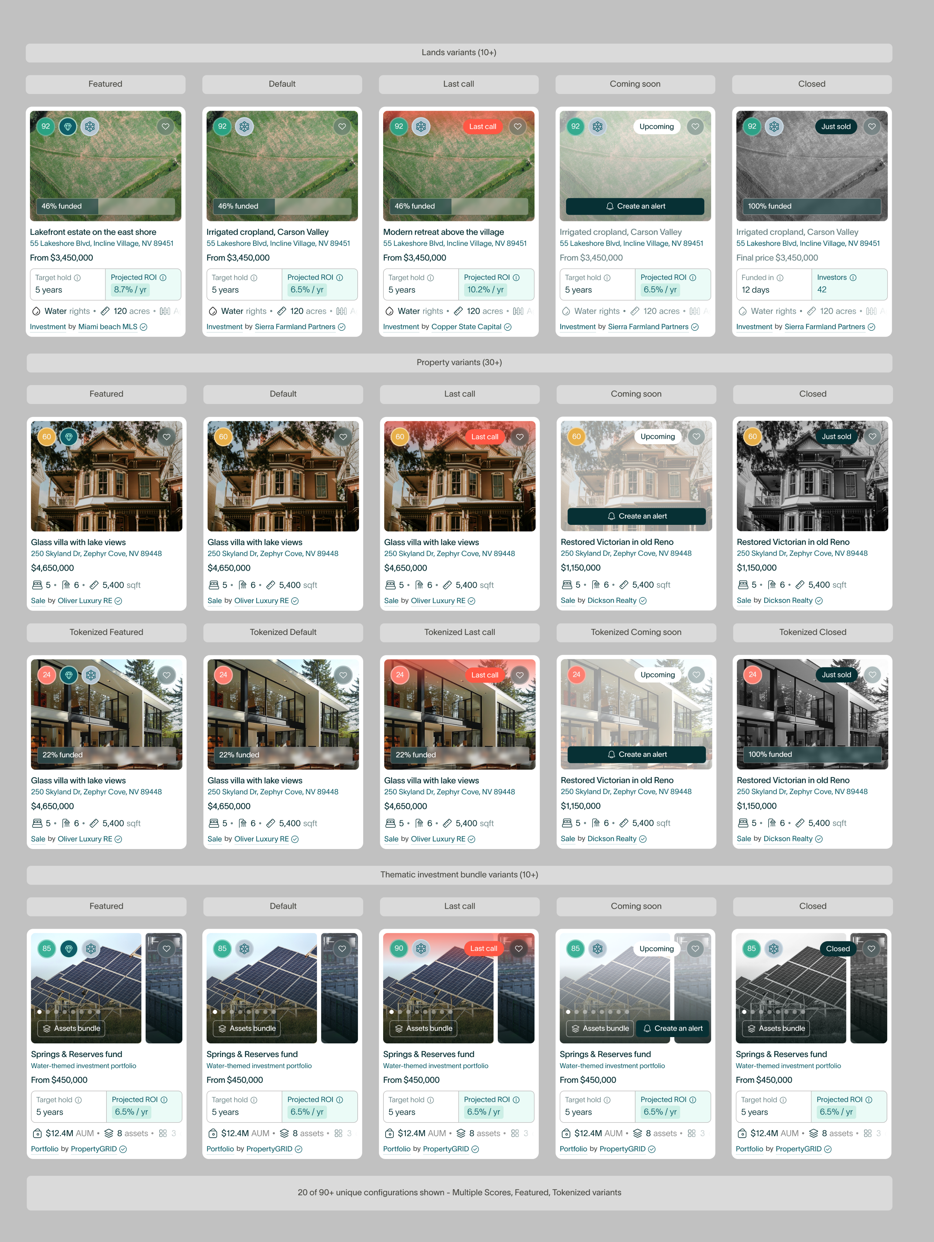
To accommodate both direct purchases and fractional investments, I designed a modular listing system that dynamically adapts data fields and status indicators (Funded, Sold Out, Coming Soon) to the asset type. Coupled with smart pin auto-clustering on the interactive map, the interface streamlines property discovery while keeping high-density inventory clear and navigable.
Property page
Why I made the property page first
A high-converting property page must reconcile two opposing user needs: triggering an emotional connection with the asset while delivering complex, trustworthy financial data. On top of that, we needed a way to onboard property owners and test market demand before building the full platform infrastructure.


Onboarding sellers and validating investments before platform launch
I prioritized designing the property detail page first as our primary 0-to-1 validation tool. The layout uses a clear structural split: full-width visual media handles emotional engagement upfront, while a dedicated financial panel breaks down key metrics like yield, ownership structure, and entry pricing. This dual-focused hierarchy enabled us to secure early inventory and validate investor interest well before launch.
Listing a property
Unlocking new revenue streams during property onboarding
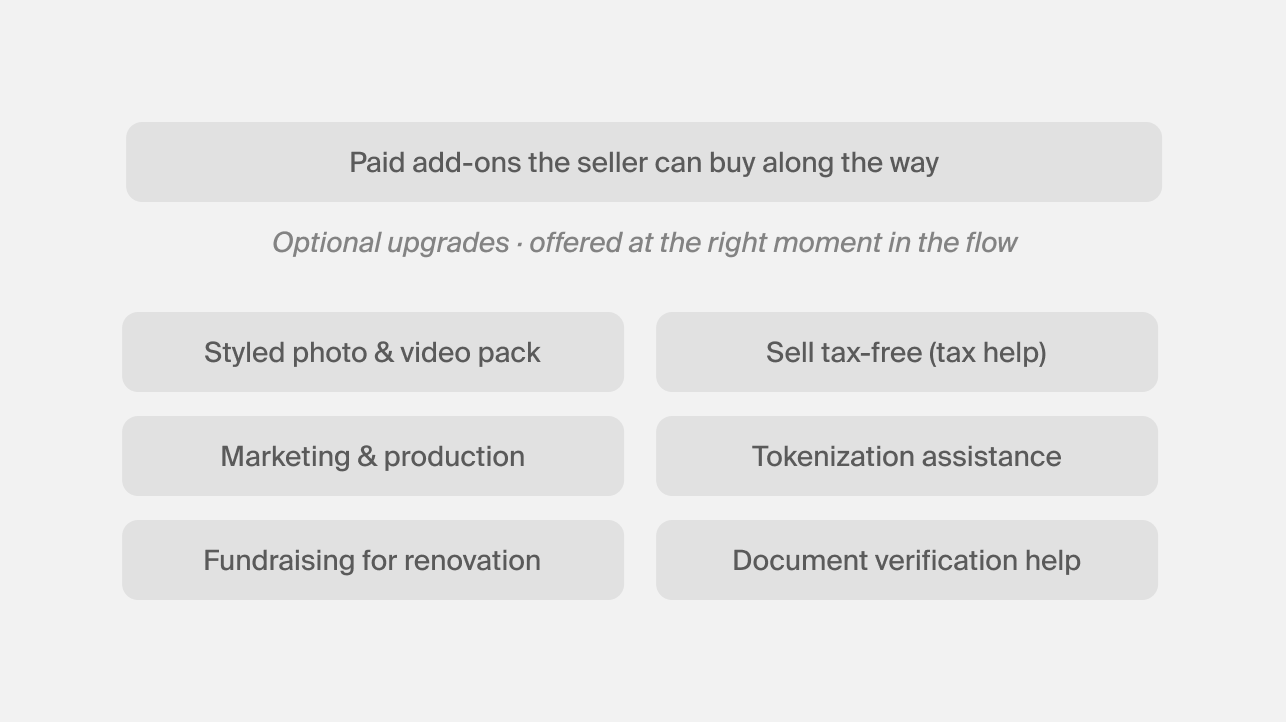
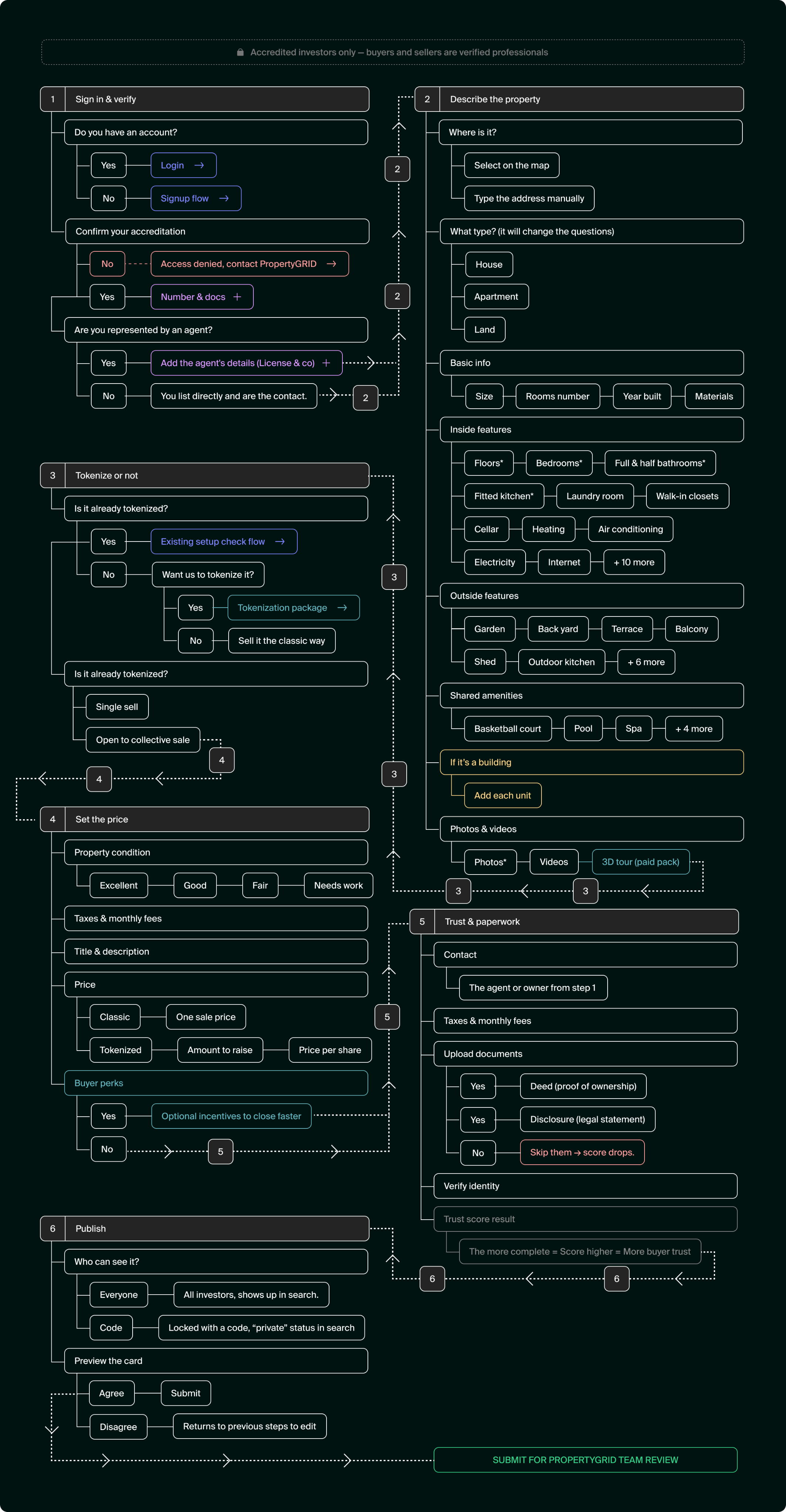
Designing the property submission flow required close alignment with our CEO, CTO, and real estate experts. I led the design to balance technical constraints with business goals, turning a heavy onboarding process into a smooth, step-by-step experience. By introducing optional service add-ons directly into the flow, we unlocked new revenue opportunities without adding friction for property owners.
Tokenized lands
Adding tokenized Land Plots & Grid Visualisation on the marketplace
Visualizing land plots and subdivisions directly on a map presented an industry-first design challenge. Standard real estate platforms like Zillow only support traditional single-property pins, while Web3 virtual platforms like Decentraland or The Sandbox offer grid systems that are far too cluttered and complex for real-world investors.
We needed a way to display parcel boundaries, land scales, and property status without turning the map view into visual noise.
Structuring map interactions for maximum clarity and deep data access
To show complex property data without cluttering the map, I organized the UI into three clear layers. A subtle grid outlines parcel boundaries for context, while clean pins highlight core scores for quick scanning. Detailed information like price, availability, and funding progress only appears on hover or tap, keeping the map readable even with dozens of listings.
Data layers
Managing Data Density on the map
Showing too much information at once made the map hard to read and navigate. To solve this, I added interactive layers and hover details so users can reveal key data only when they need it, keeping the interface clean and easy to scan.
Mobile UX
Freeing up screen space for mobile users
Fixed controls were taking up almost half of the phone screen, making map navigation feel cramped. I moved non-essential elements into dedicated views so the map gets full-screen space, keeping core tools accessible only when needed.
Beyond the screen
Beyond product design: I created the pitch decks alongside leadership that helped secure $6M and co-hosted key events
Investor Decks
Designing pitch decks for two different investor mindsets
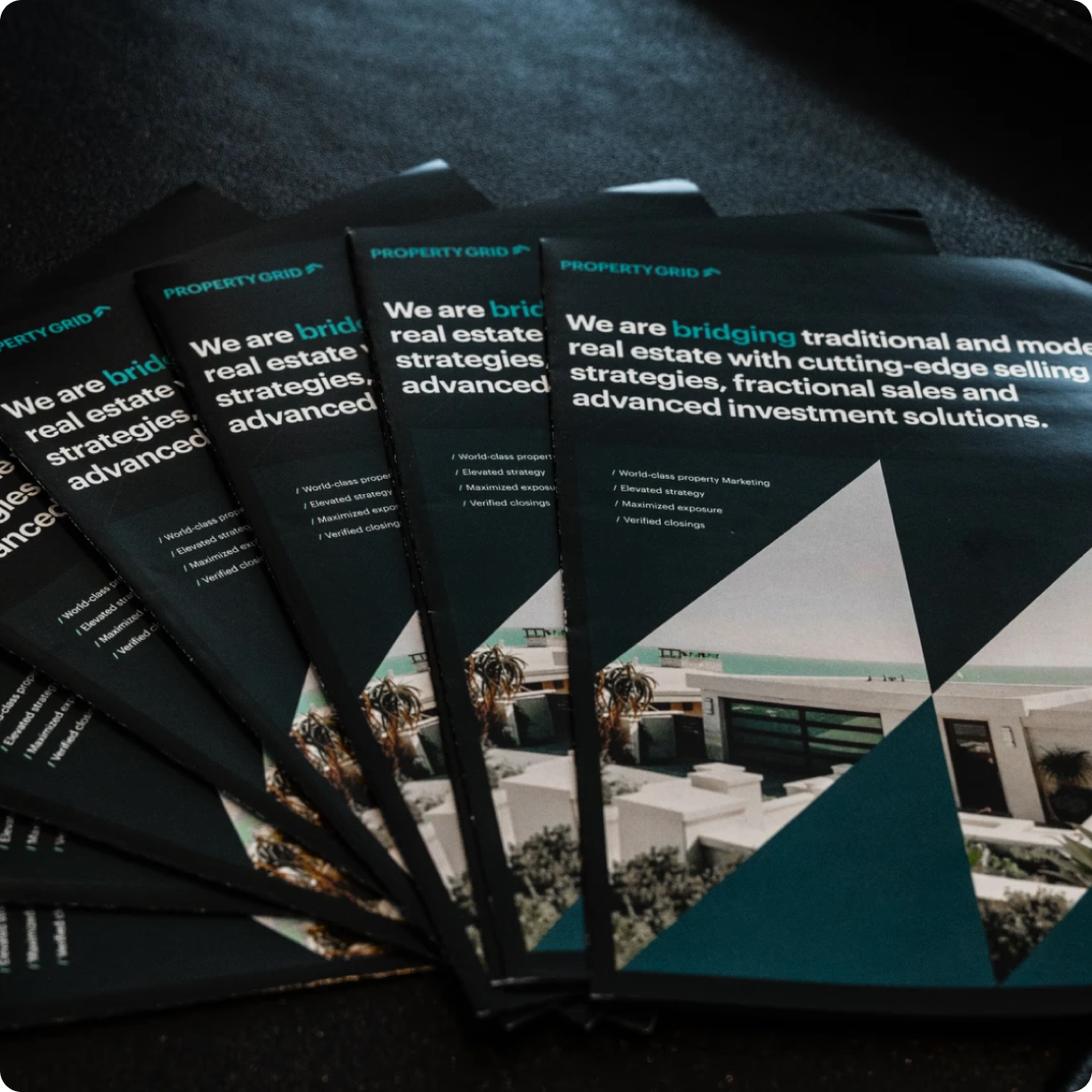
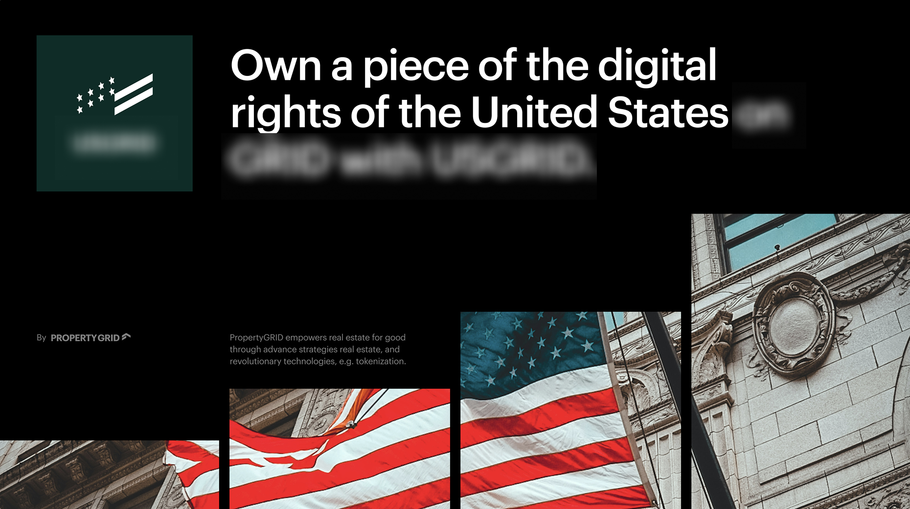
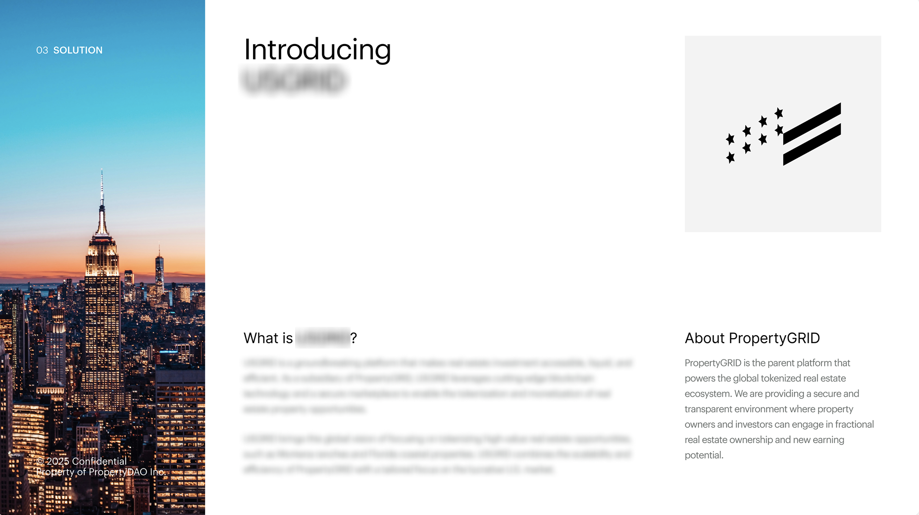
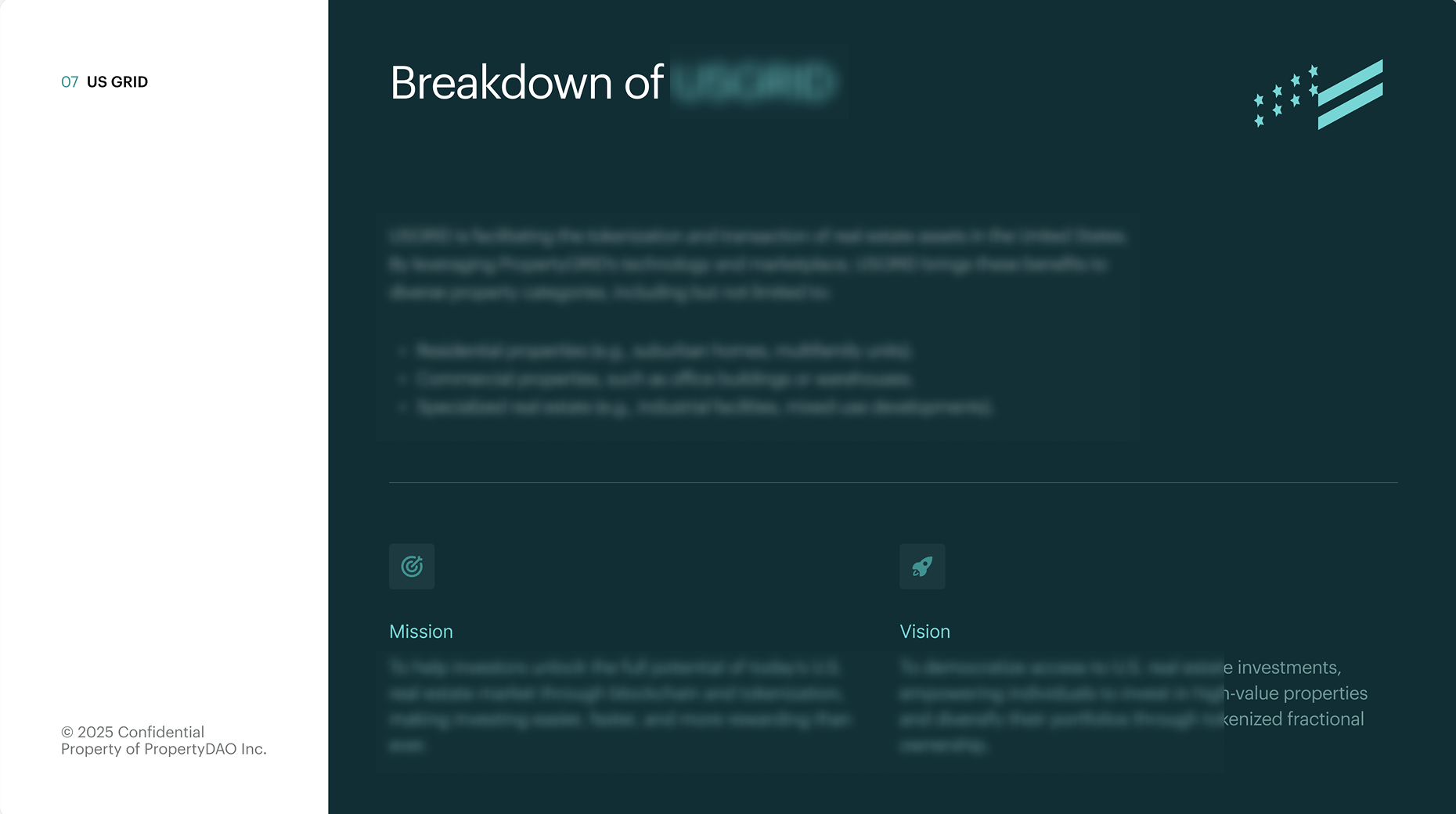
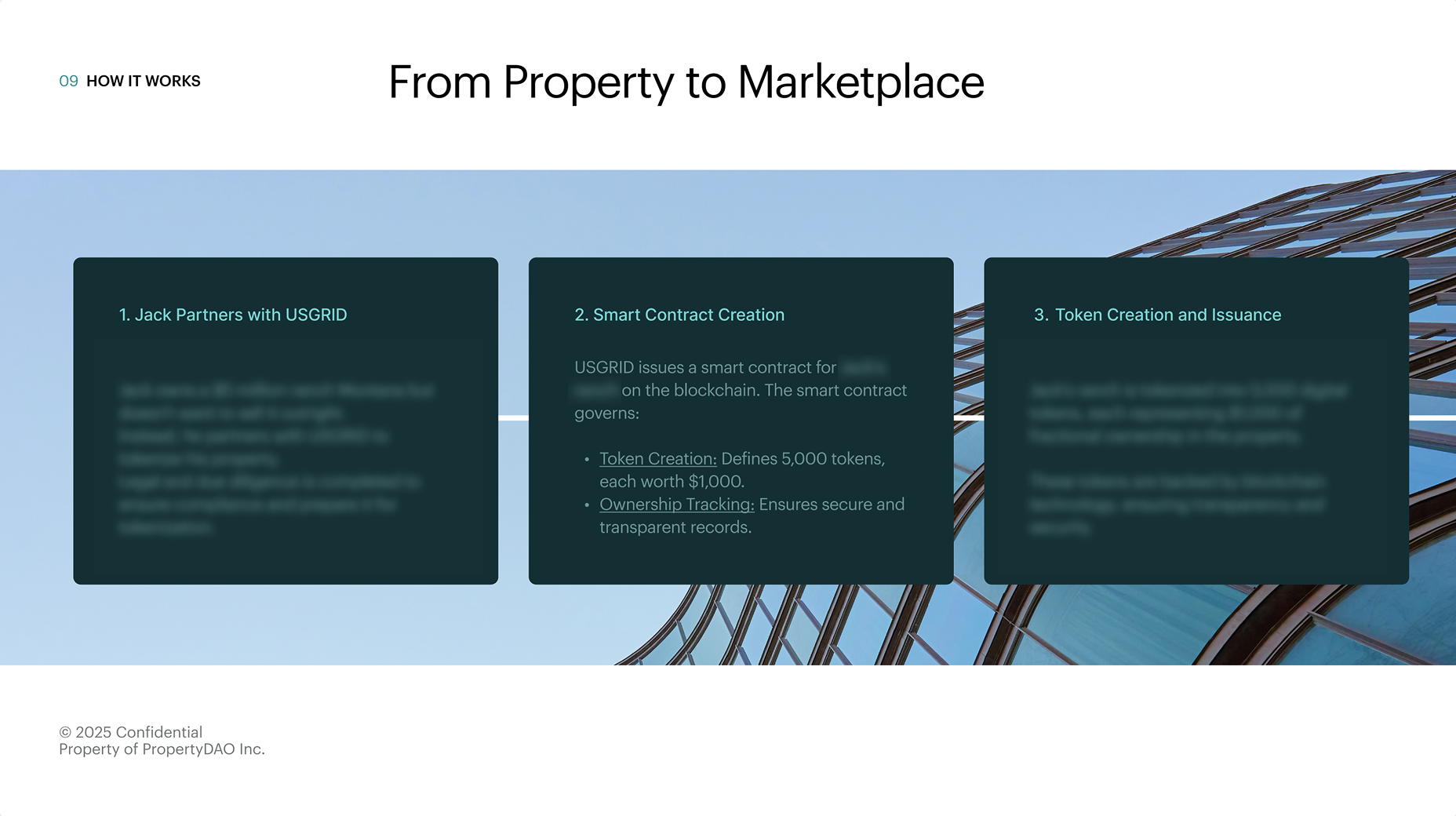
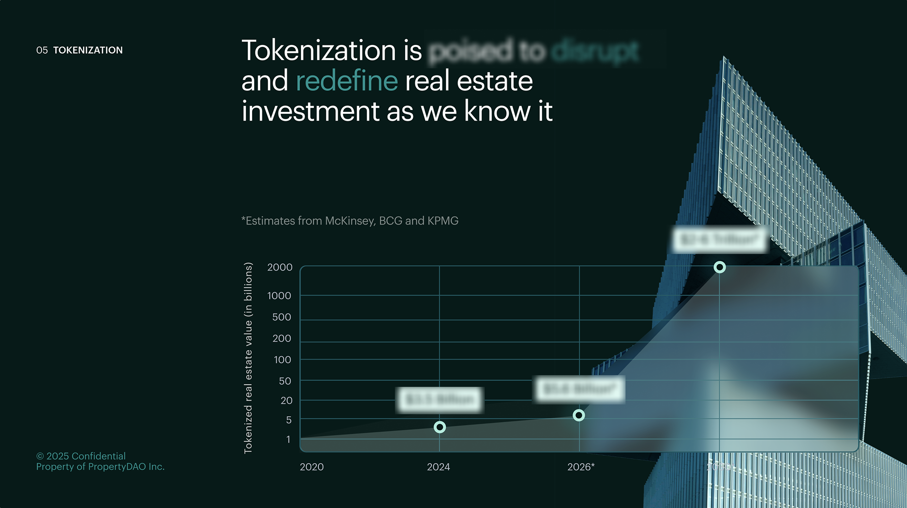
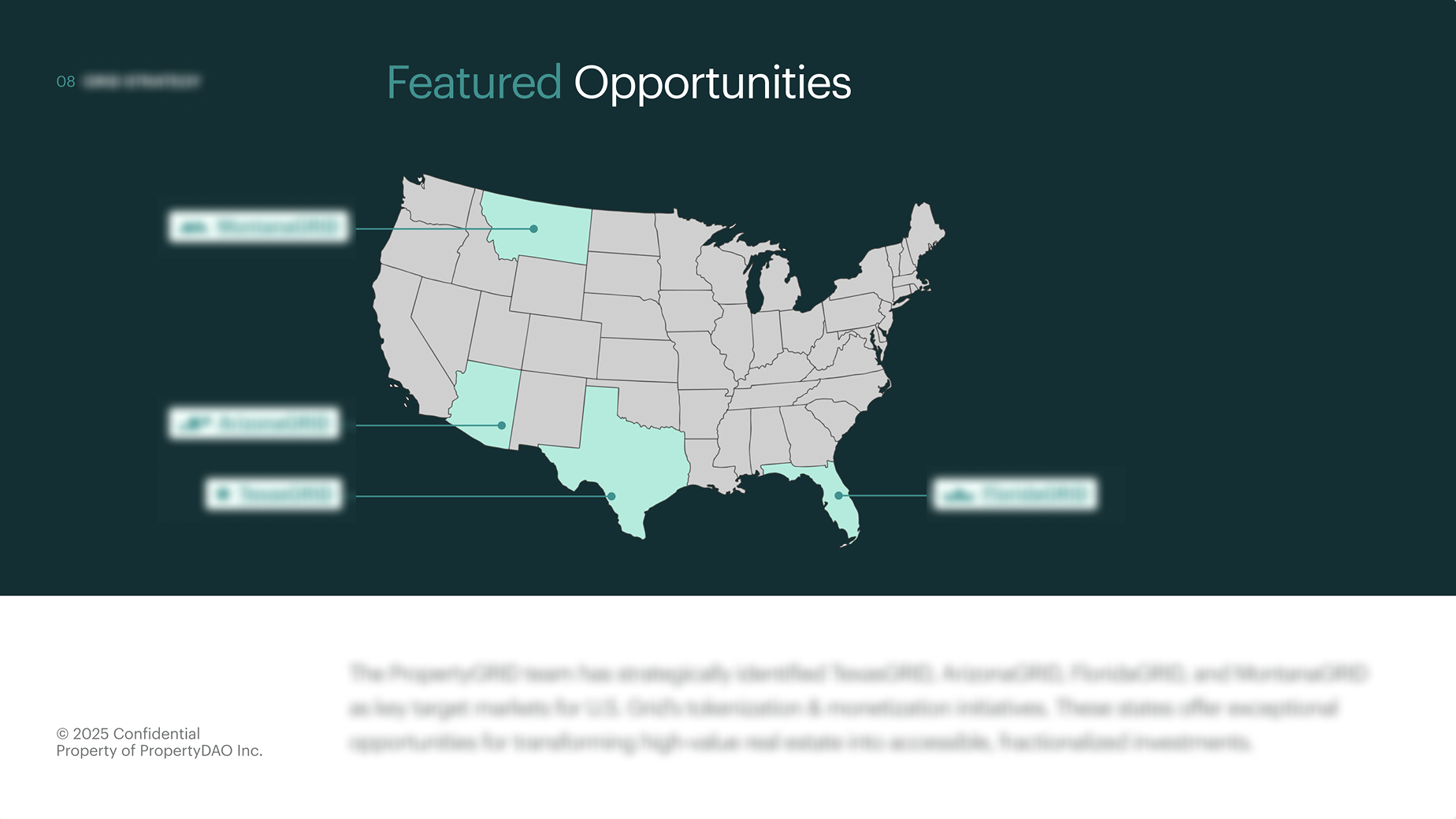
Our pitch decks needed to convince both conservative institutional investors and modern, tech-focused buyers. I built a clear story structure paired with a clean visual identity. This balanced traditional financial credibility with digital innovation, presenting PropertyGRID as a safe yet forward-thinking product.

Events design
Participation à l’intervention lors d’événements et à la stratégie pour attirer de nouveaux utilisateurs

Takeaways
What I learned joining PropertyGRID and designing for real world assets
Navigating complex technical terminology
Blockchain and Real World Assets (RWA) come with heavy technical jargon. We spent significant time aligning on technical requirements before translating them into UI flows. Having a centralized repository early on to simplify and translate domain knowledge would have saved us valuable time and improved overall clarity.
Designing for two-sided marketplaces
Balancing the needs of buyers and property owners is a classic prioritization challenge. I proposed starting with the property page and the upload flow first. This allowed PropertyGRID to demonstrate immediate value to property owners, even while using traditional billing methods initially. The key takeaway was to launch early, test quickly, and iterate in small increments.
Aligning diverse stakeholder priorities
Each leader in the company had distinct priorities, requiring me to balance competing requests. I navigated this by tying design decisions directly to business goals, creating a shared product framework that brought alignment across leadership while keeping user experience at the center.
Leading and mentoring designers
I mentored and led two to three designers and visual creators. To bridge different working styles, I hosted weekly sessions to share problem-solving frameworks and foster an open, transparent environment where team members felt safe raising roadblocks so we could progress together.
Press
Disrupting US real estate: press coverage and industry keynotes
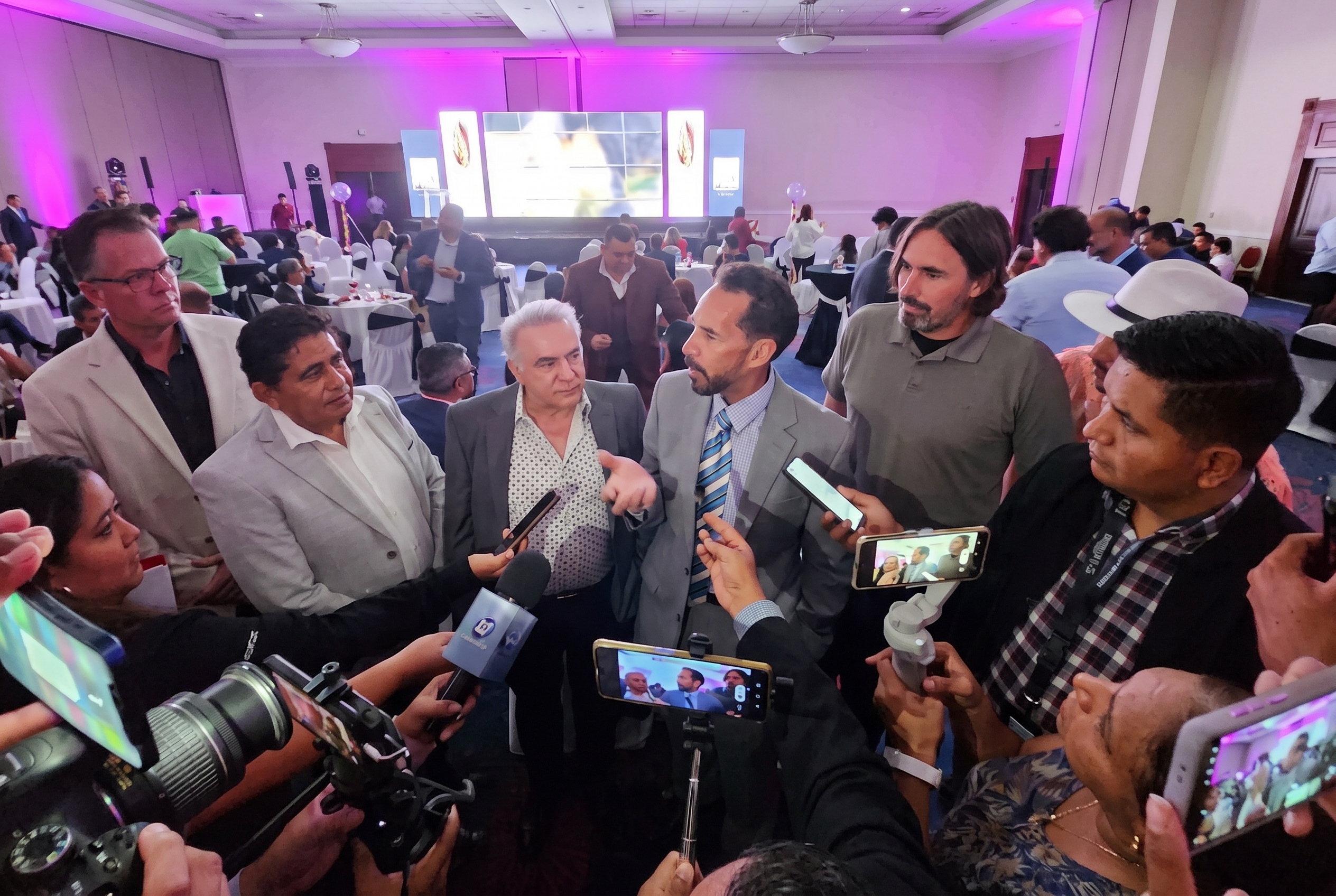
PropertyGrid Revolutionizes Real Estate(Yahoo Finance)
Podcast with Steve Rodgers(Mortgage Lending Mastery)
PropertyGRID launches investment platform in El Salvador(Dinero)
PropertyGRID launches the real estate...(Mercadosyfinanzas)

Social proof
Adaptive grid & social proof: visualizing fractional ownership
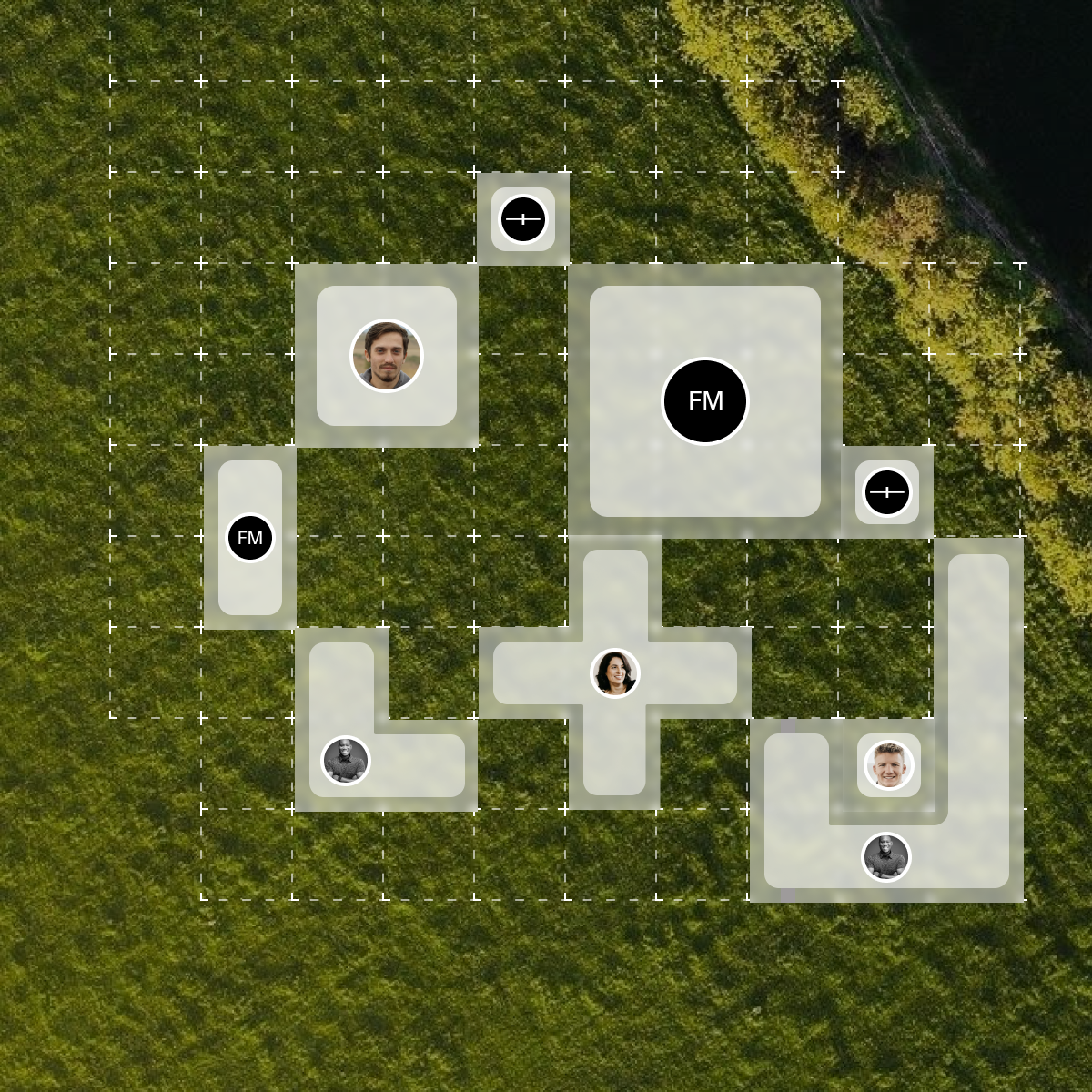
To build buyer trust, we needed to highlight active investors in real time, but displaying irregularly shaped land parcels made the grid messy. I designed a modular grid system that snaps varied plots seamlessly together, complete with buyer avatars on funded parcels. This instantly shows live activity and trust while keeping the layout clean and unified.